Pen Show Calendar
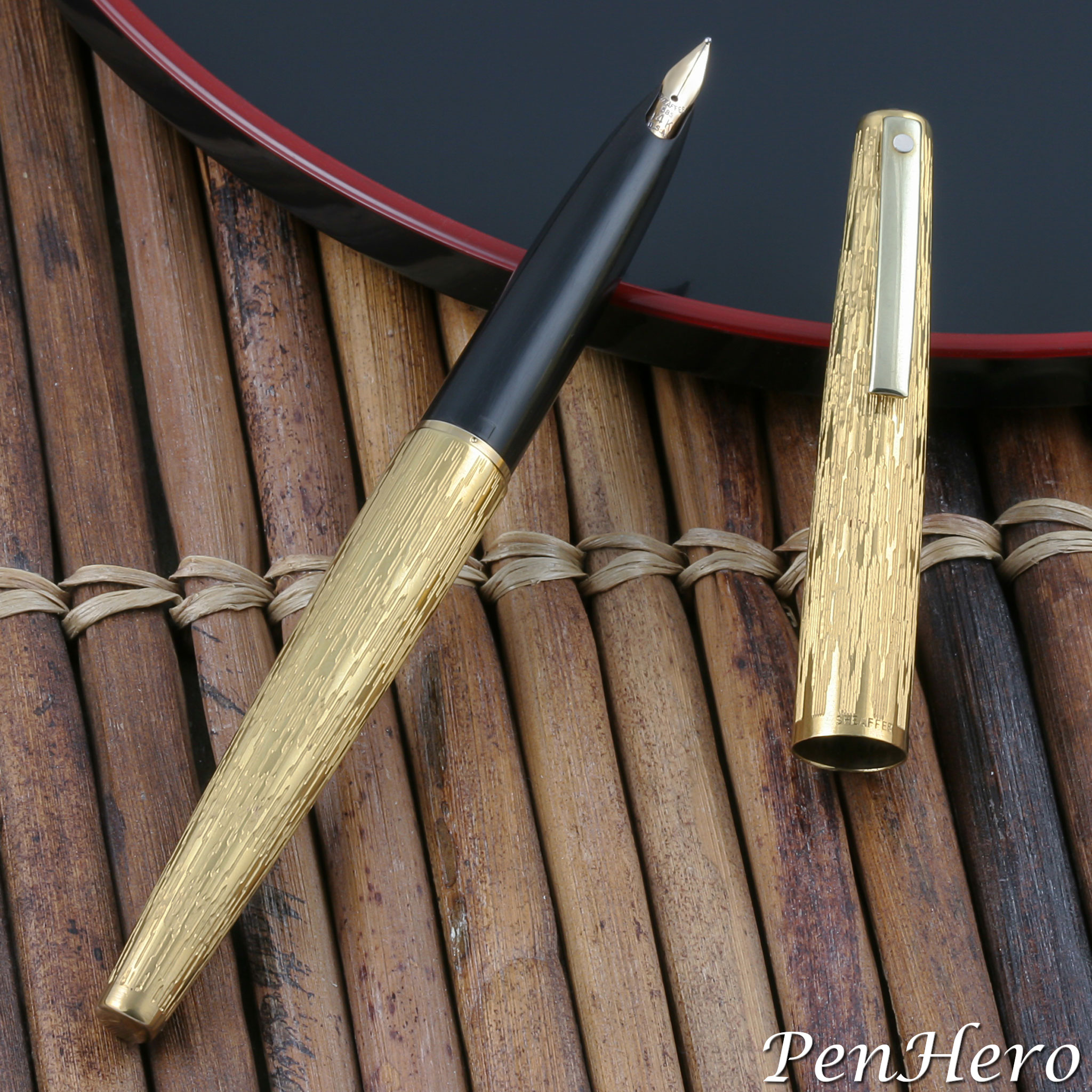
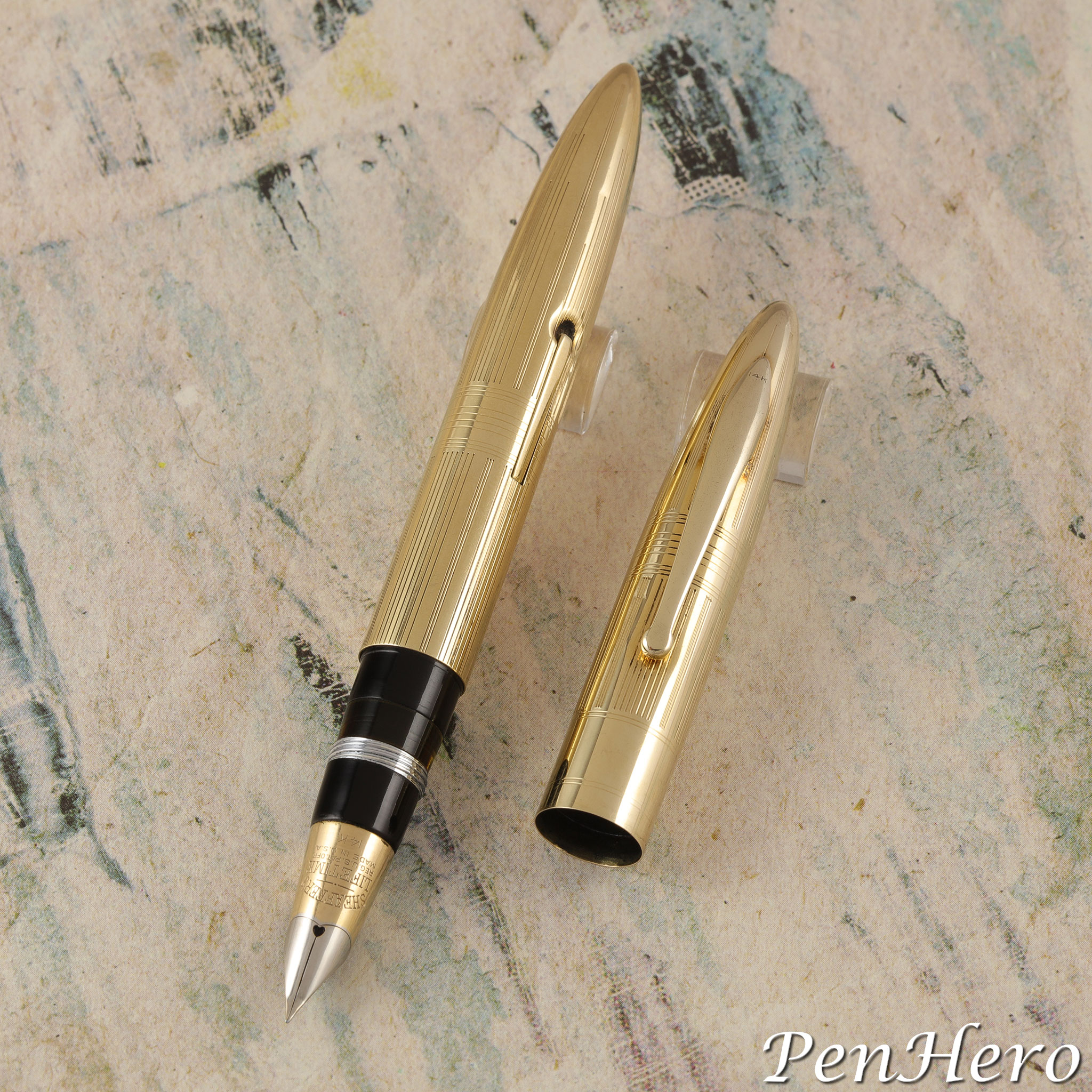
Lady Sheaffer "Flammé" 1974-1976
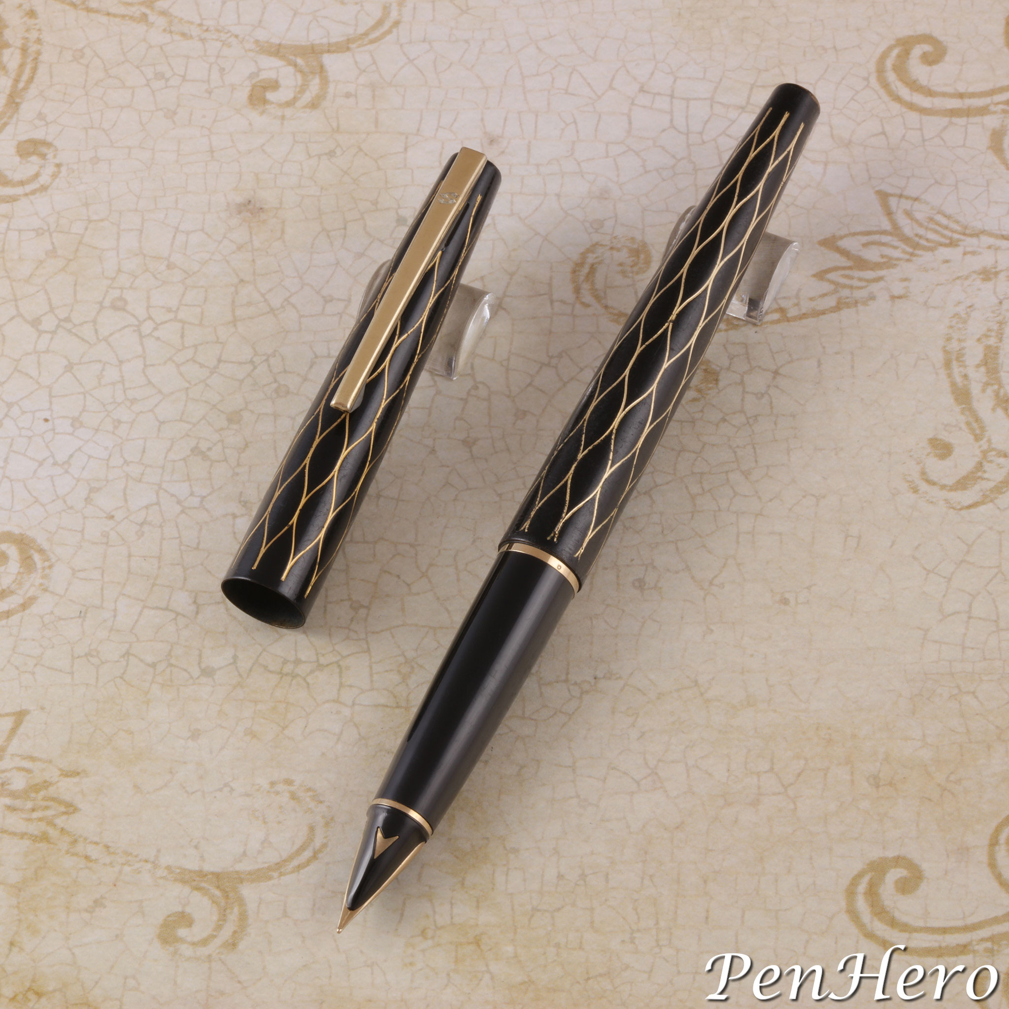
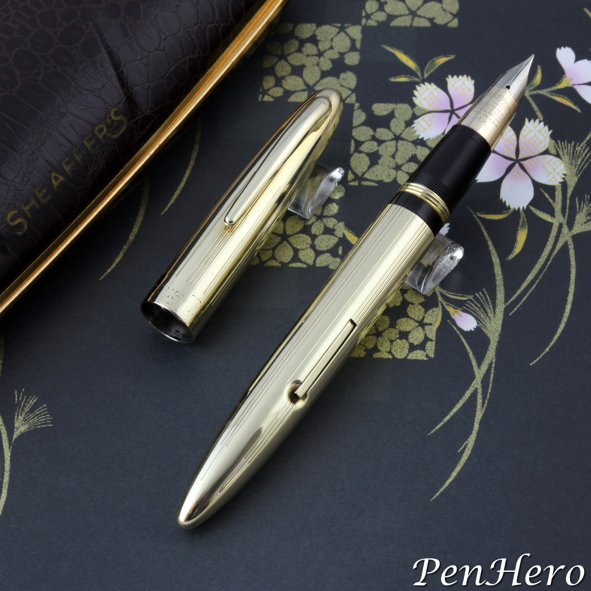
After completing the work on the article “Lady Sheaffer White Dot Short Clip Pens c. 1971–1989: A Gallery” I noticed how out of date this 2010 article was. Time for an update! This pen, model 921, was introduced in 1974 and does not have a formal name, but is described in the Sheaffer 1974 and 1976 catalogs and price lists as “heavily gold plated with chevron patterning.” Collectors dubbed the engraving pattern "Flammé" for its deeply engraved waves of flame flowing down the cap and barrel.Read the story about this interesting pen here!
Lady Sheaffer White Dot Short Clip Pens c. 1971–1989: A Gallery
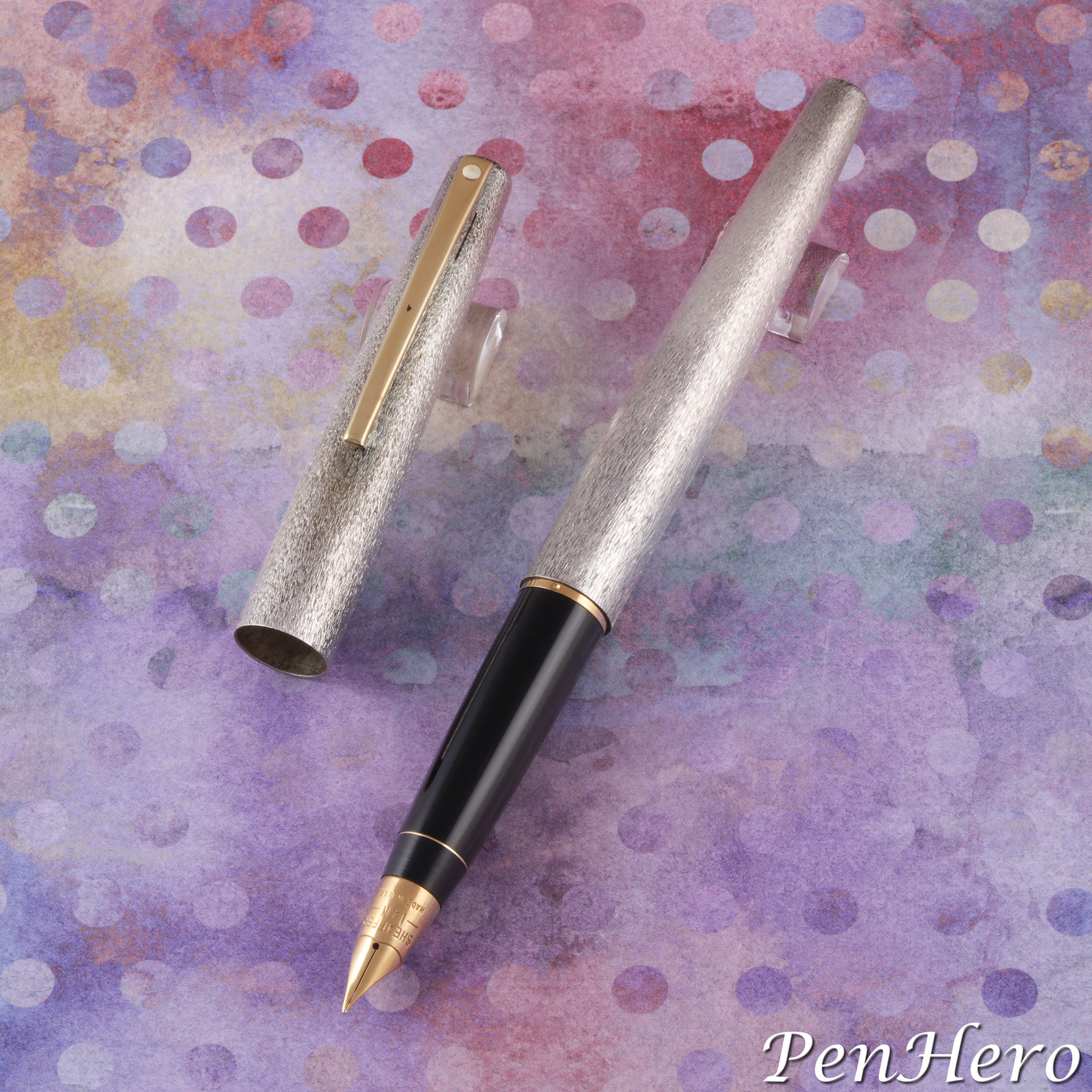
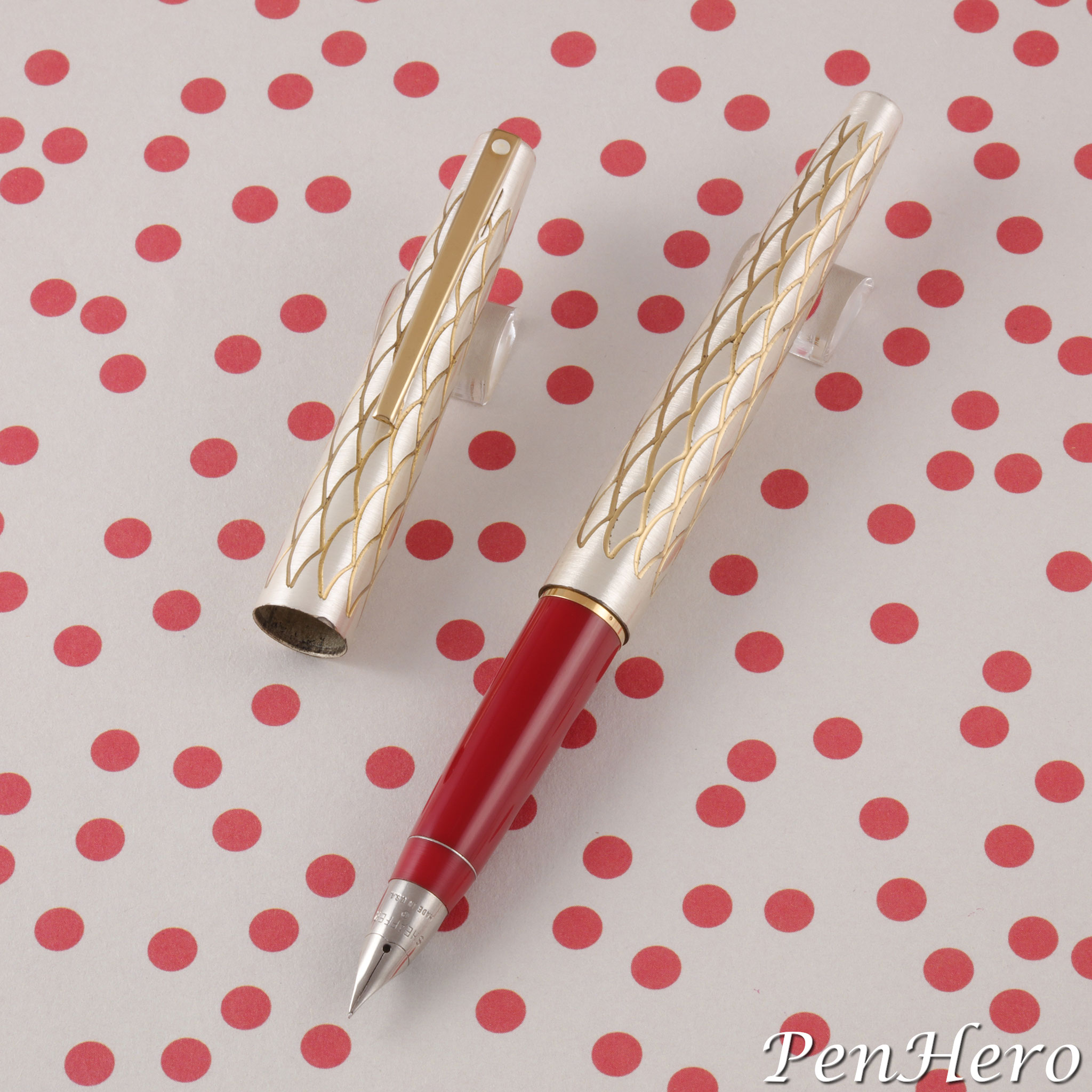
The final lineup of Lady Sheaffer pens are easily identified by a short, bar-shaped clip with the Sheaffer White Dot at the top. Some early models will have the short conical nib, a holdover from the previous long clip pens, but this begins to give way, not later than 1973, to a recessed nib section across the line. Recessed nibs were made of stainless steel, 14 karat gold (US and UK), or 18 karat gold. Lady Sheaffers made from 1971–1989 are not uncommon, but some models are significantly more difficult to find than others. They are a niche collectible pen, but interest has been gaining in the last few years. A complete collection of the 21 known production models is not going to be excessively expensive to pursue, especially if less than mint condition examples are acquired. As with other Sheaffer pens from the same period, they are good writers and reliable.Read the story about these interesting pens here!
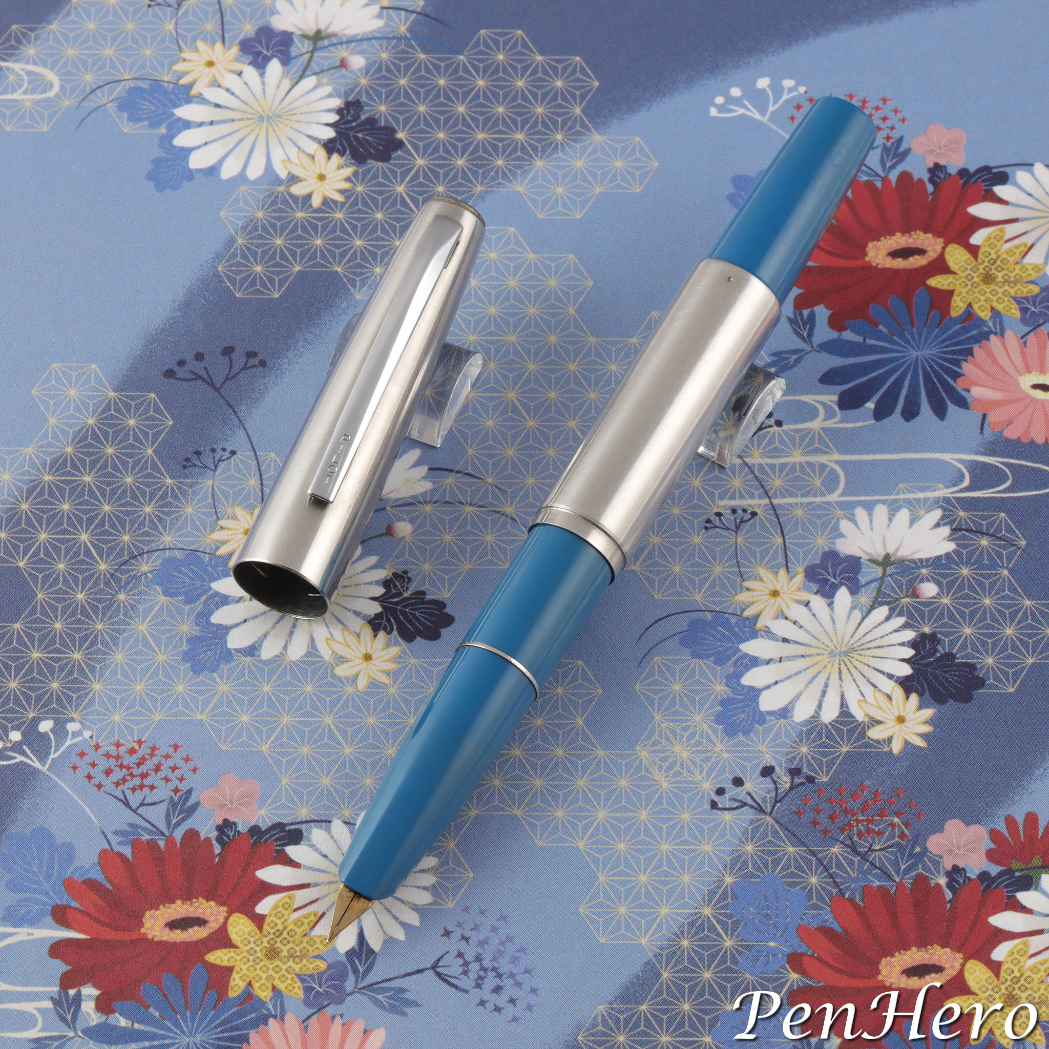
Pilot Short S-150SS Fountain Pen With Telescoping Section c. 1966-1969
An update showing the blue and cream/white pens. The Pilot Short is among the many 1960s to 1980s Japanese pens that are short and compact when capped and become long enough for comfortable writing when the cap is posted on the end of the barrel. To make this work, the cap and section are both quite long for the size of the pen. The Pilot Short has an added feature: the section can be extended by pulling on it, which increases the posted length from 5 1/16 to 5 5/8 inches, making it a very compact pen closed and still a comfortable pen to write with. Because of this quirky feature, the Pilot Short pens are often called “short telescoping” or “long-short.” The cap proportion to the barrel is less dramatic than on the Pilot Elite S and other similar pens, making the Pilot Short the one with the shorter cap.Read the story about these interesting pens here!
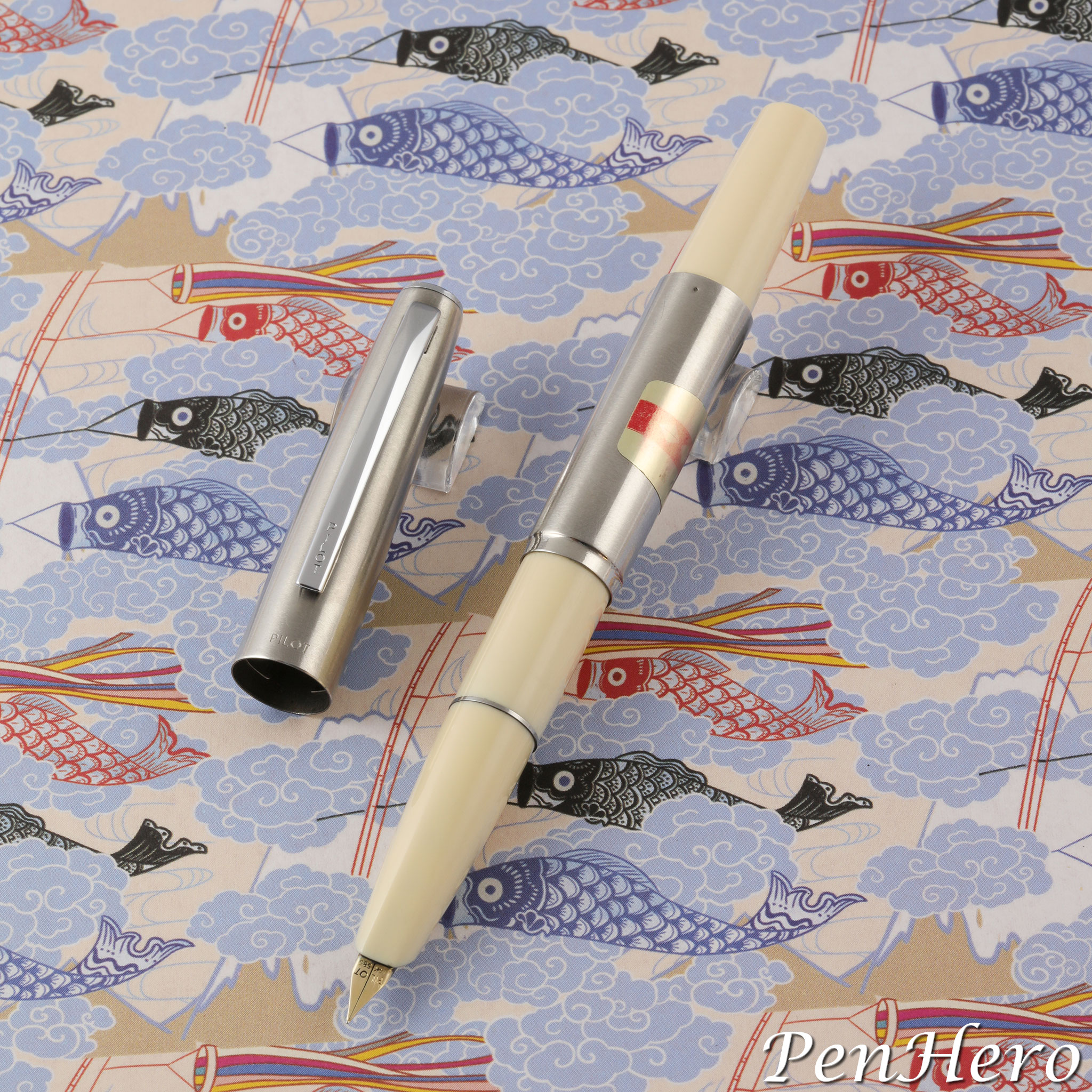
Pilot Short S-150SS Fountain Pen Cream Color 1968
Before heading out to a pen show it's good advice to make a list of pens that you are interested in finding. It is nice to see all the versions and finishes of a pen, especially if it is the subject of a future article. The article on the Pilot Short S-150SS fountain pen posted in 2024 showed three of the colors but was missing the blue one. A search for the blue pen was successful, but soon afterward this cream/white pen was found. Were more colors made?Read the story about this interesting pen here!
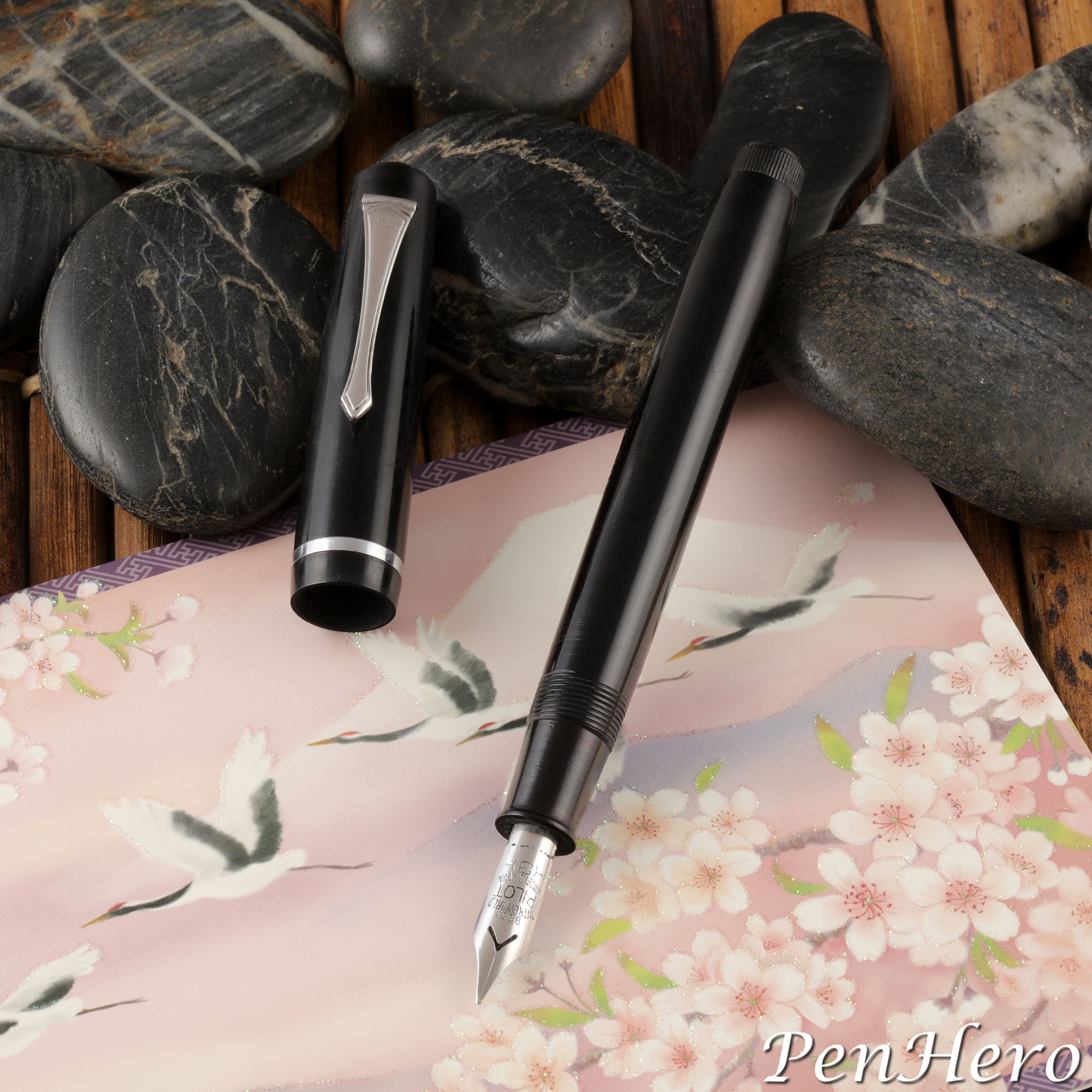
Pilot R-O-Type Eyedropper Fountain Pen c. 1937-1945
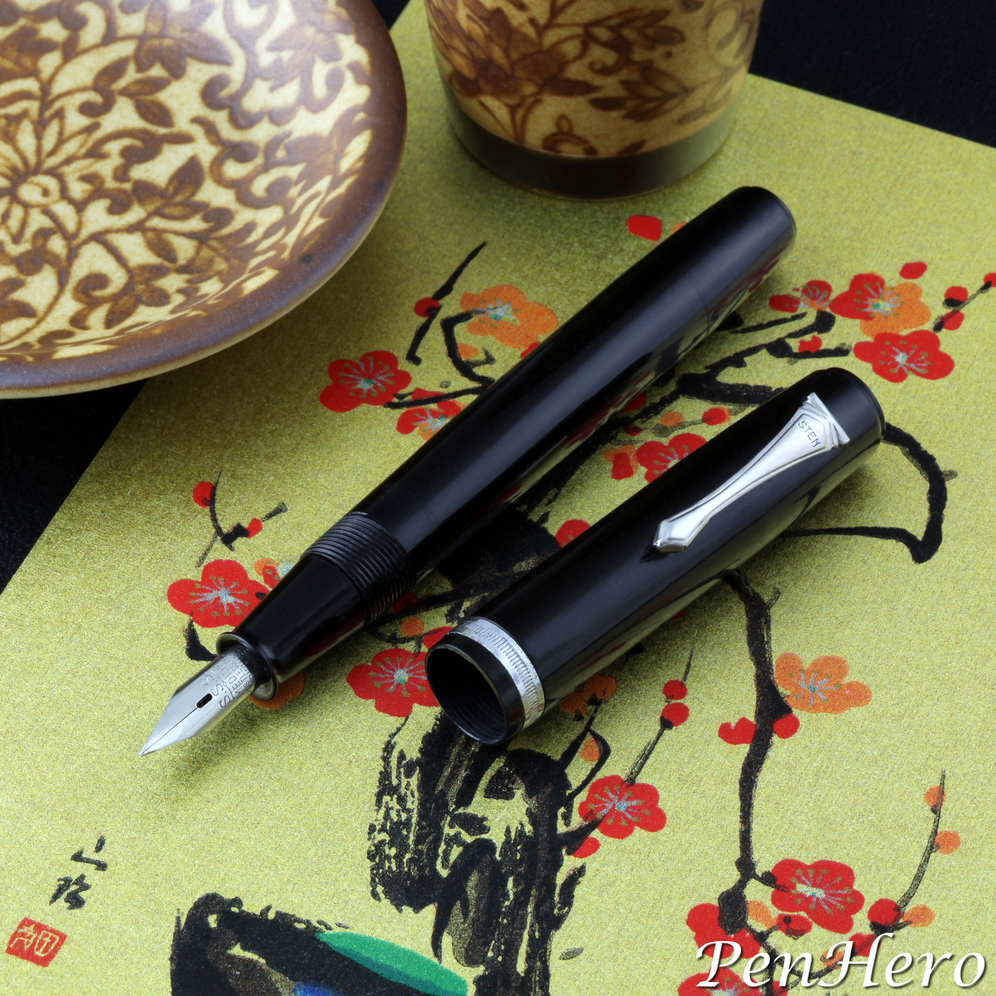
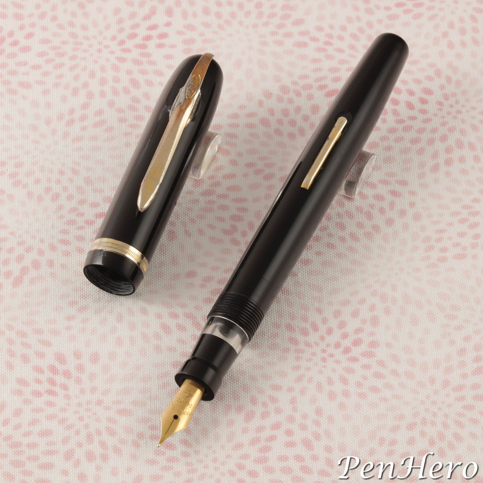
This black hard rubber Pilot R-O-type ink shut off eyedropper fountain pen is the earliest R-type version, c. 1937-1945, identified by the clip and cap design. The kikuza (菊座) “chrysanthemum” clip is shaped like a tie. It’s stamped PILOT on the face and is the most decorative one found on R-type pens. This clip can be seen in Pilot advertisements from 1937 to 1945, and a simpler version was added during World War II. The cap top is sometimes called a “rooftop” cap, with its ledge and peak design. The R-type would be the look of Pilot pens for over a decade.Read the story about these interesting pens here!
Pilot Phoenix Emperor Hirohito 60th Anniversary Pen 1986
On December 25, 1926 Emperor Yoshihito died and his son Hirohito became the 124th emperor of Japan. Hirohito died on January 7, 1989 and was Japan’s longest reigning emperor at just over 62 years. His time as emperor is known as the Shōwa (昭和) “enlightened peace” era. The 60th year of his reign was celebrated on April 29, 1986, Hirohito’s 85th birthday, about six months before the actual anniversary date. This ornate silver fountain pen was made by the Pilot Pen Company in 1986 to commemorate the event.Read the story about this interesting pen here!
Parker 105 Bark Finish Rolled Gold Pens 1979-1982
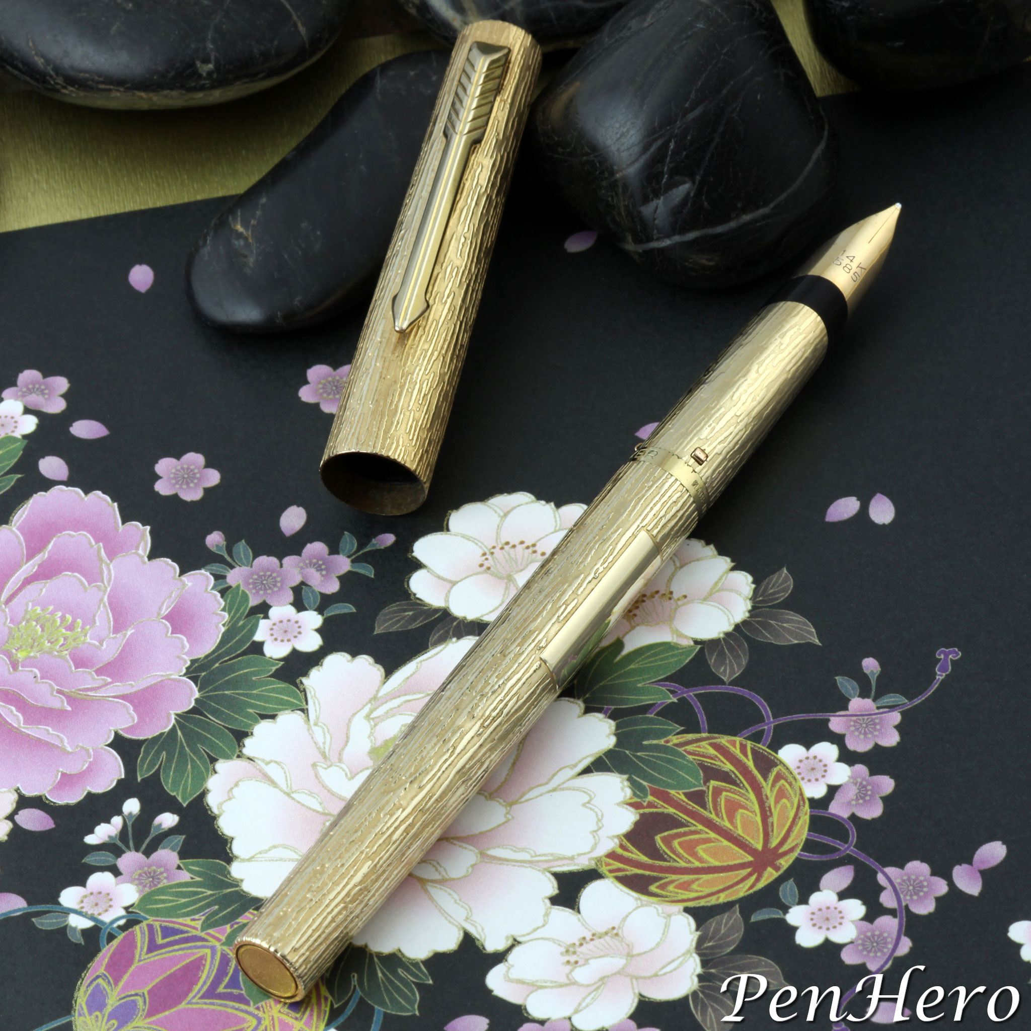
The Parker 105 was a literally bold departure from the company’s more slender flagship Parker 75 models. It has admirers and detractors. Admirers will call the pen “distinctive,” especially for the deep, textured “bark” finish on the rolled gold models. The very beautiful finish looks almost hand carved but is probably machine engraved. The Parker 75 and Parker 45 lines epitomized the look of a Parker pen from the early 1960s into the 1990s with millions of each across dozens of models made. By comparison, the 105 is big, cylindrical, and heavier, with a blocky looking clip mounted near the top face of the cap. It was not a hit with Parker customers, introduced in late 1979 and made only until 1982.Read the story about these interesting pens here!
Salz Favorite Fountain Pen and Pencil Combo c. late 1930s
The very small, 4 1/8 inch long, Favorite tiny fountain pen and pencil combo shown here is made of a pretty blue and plum marbled celluloid. Although the clip patent is from 1931, its similarity to the late 1930s Eagle Pencil Company’s Elfin line likely dates it to the mid to late 1930s. The cap and barrel have eight facets, and the marbled celluloid is wrapped at an angle. It has FAVORITE stamped on the gold plated clip and nib. The light gold plating is easily worn off, and on this example is almost completely gone. There are no other markings except a personalization. For comparison, Eagle’s Elfin combos, fountain pens, and pencils each retailed for 25 cents in 1937.Read the story about this interesting pen here!
Kraker Fountain Pens 1914–1916: A Gallery
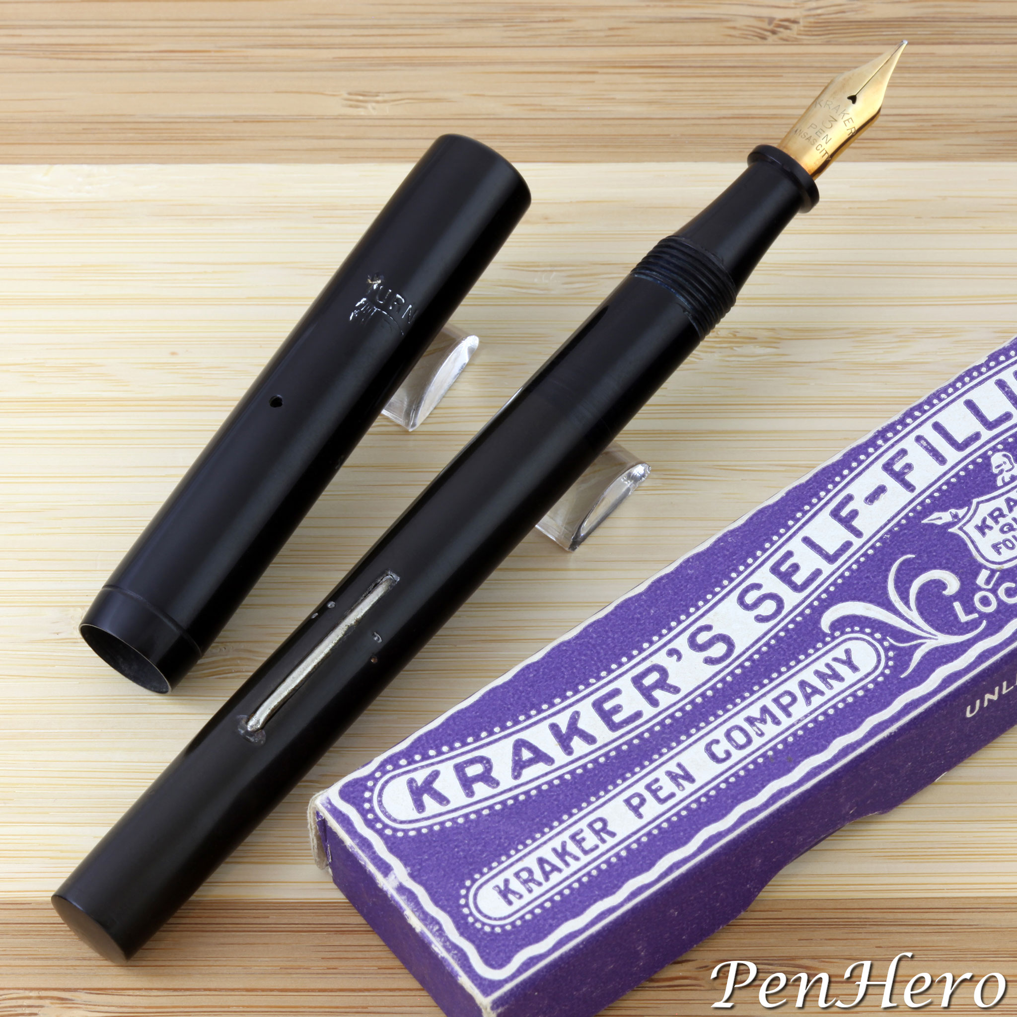
The six Kraker fountain pens shown in this gallery article were photographed for a series of two articles that appeared in the spring and fall issues of the Pennant magazine in 2020, “The Beginning of the Kraker Pen Company” and “The Kraker Pen Company, Part II: Growth, Good Times, and Closure,” both by Nathaniel Harter. If you’re not a member of Pen Collectors of America, you’re missing out on a lot of great stories about writing instruments and the people and companies who made them.Read the story about these interesting pens here!
Champion Fountain Pens c. 1948
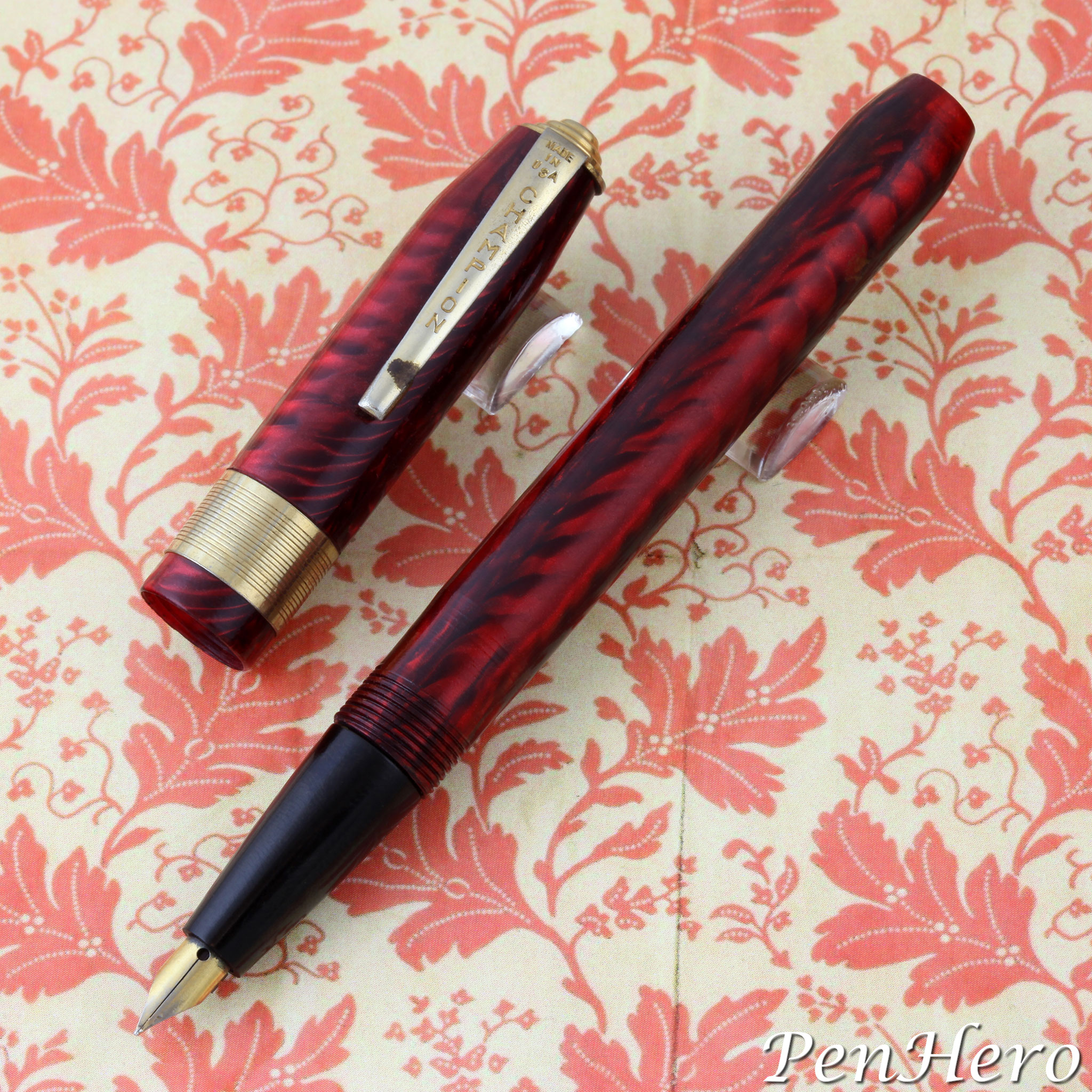
This Champion fountain pen was included in a bag of pens purchased on an antiquing trip. Though it was looked like just another random cheapie, though with very pretty celluloid, it has an interesting story. Champion was not mentioned in any pen books and shows up in very few internet searches. Where they do are a few pens for sale, not generally in great condition, and with speculative information as to their maker. Want to find out who made them and when?Read the story about these interesting pens here!
Roxy Fountain Pens c. 1946-1950
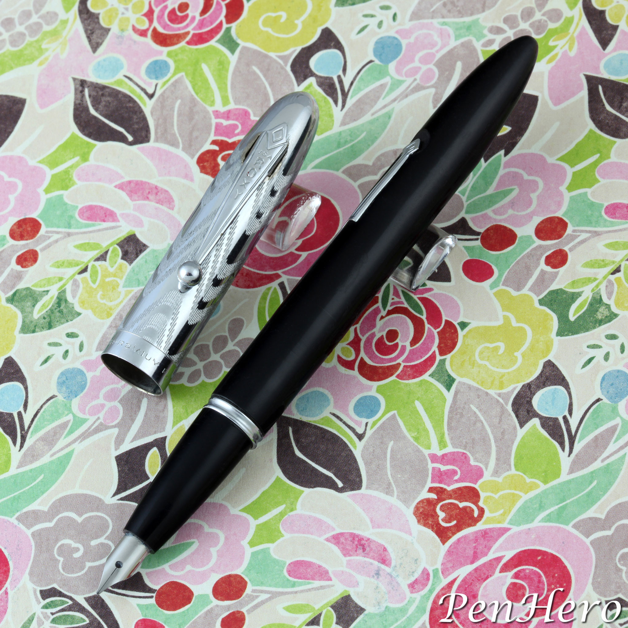
Roxy fountain pens were a sub brand of the Morrison Pen Company of New York, New York. The company was founded by brothers Louis and Abraham Morrison in 1910. There are three types of Roxy pens that I have been able to identify from 1946-1950. All of them clearly identify the Morrison Fountain Pen Company as the manufacturer. Shown above is the second type of Roxy fountain pen, the “Black Beauty.” It sold for 98 cents in 1950 and came in every color you could imagine, as long as it was black. Depending on the version, the chrome plated chased cap pulls off to reveal an open stainless steel nib or a tapered section with a small stainless steel nib.Read the story about these interesting pens here!
Unbranded Parker 51 Style Fountain Pen With Morison Nib c. 1952-1955
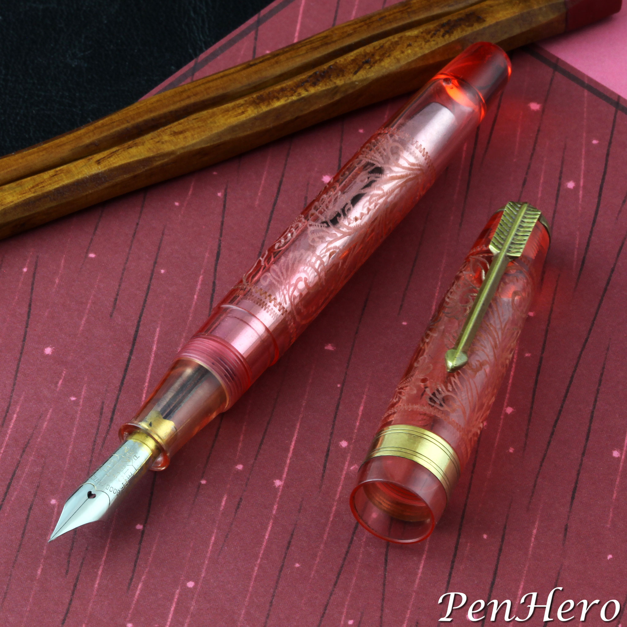
This is one of the many 1950s Japanese pens made to look like the immensely popular Parker 51 Aerometric fountain pen. Some Japanese manufacturers essentially copied the Parker 51, while others made pens with similar visual cues such as selective or modified use of the hooded nib, the arrow clip, and the cap and barrel shape. Many of these “homage” pens are found with open nibs and are made of different materials than Parker used. This 5 3/8 inch long squeeze filling pen would fall into that latter category. The maker of this pen is unknown, but they put some effort into making an interesting pen for their prospective buyers, probably school kids. The clip and squeeze filler are direct knockoffs of the Parker 51 Aerometric. The nib is a conventional stainless steel open type. The elaborate lacy design on the cap and barrel may be etched rather than engraved as it’s not very deep. I doubt it’s hand engraved. Seeing the clear parts, especially the clear grip section would signal to collectors today that this may be a demonstrator pen.Read the story about this interesting pen here!
Uetosi Ink Shut-Off Eyedropper Fountain Pen With S.S.S. Nib c. 1938 to 1952
A few years ago, when pen hunting in Maine, we ran across an antique store with a lot of very unusual pens, including several Japanese eyedropper pens that have a shut-off knob at the end of the barrel. This black hard rubber fountain pen, similar to many from the late 1930s to the early 1950s, has a very interesting imprint stamped on the barrel. Left to right it begins with a chrysanthemum outline logo and then there are two text lines, the top in English and the bottom in Japanese characters. The top line is UETOSI & CO. "Uetoshi" translates to "top," so perhaps the brand translates to "Top (Fountain Pen) & Co." The bottom line is Japanese kanji characters that roughly translate to “record number 5677.”Read the story about this interesting pen here!
Wahl-Eversharp Uncatalogued “Charlie Brown” Design c. 1924-1927
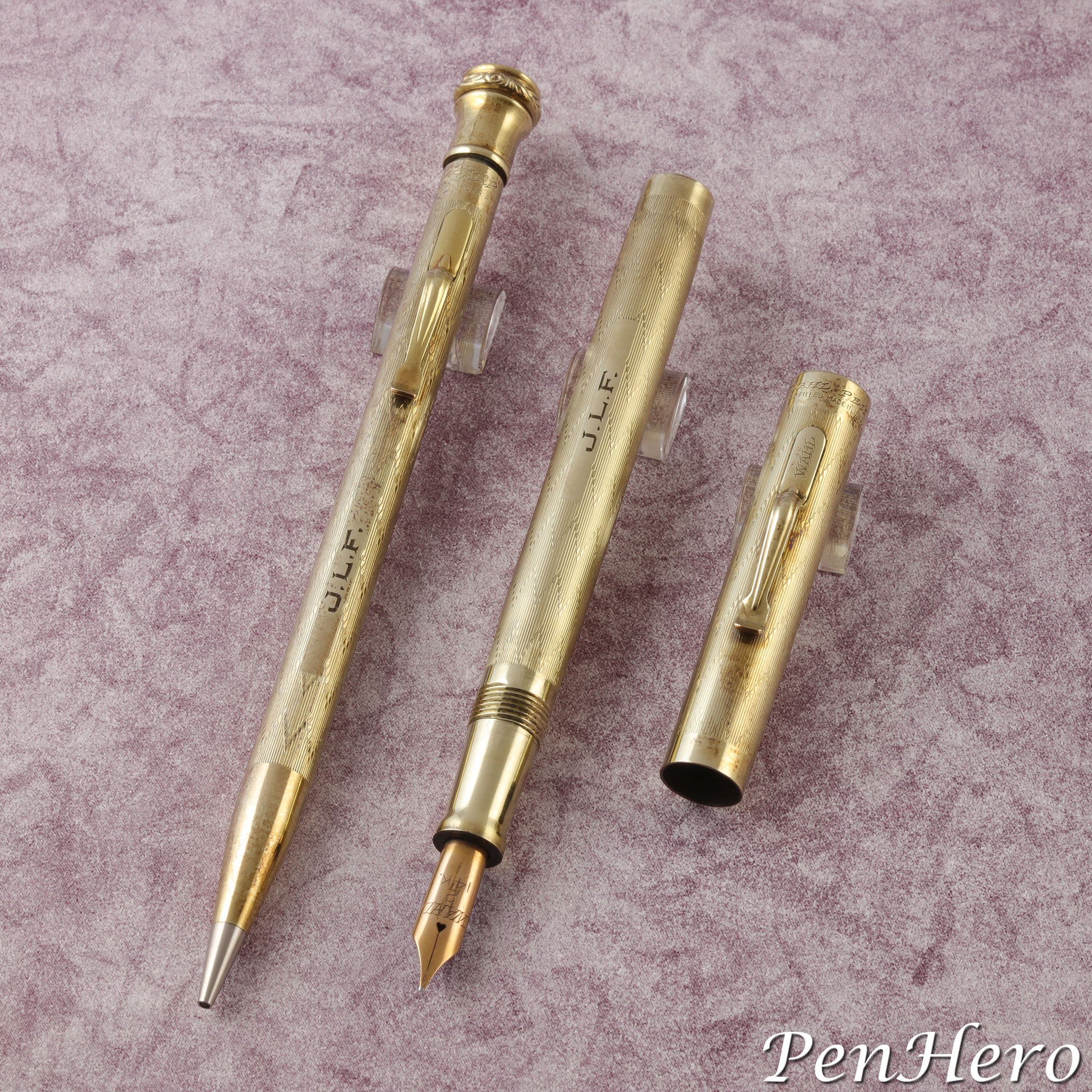
The pattern on this engine turned Wahl-Eversharp pen and pencil set is a combination of the Dart and Colonial designs. Colonial is a repeating pattern of straight lines around the cap and barrel. Dart is a repeating pattern of panels of straight lines with a small curve out that create a repeating arrowhead effect on the panels around the cap and barrel. Put them together and you get "Charlie Brown!"Read the story about this interesting pen set here!
Sheaffer Stylist 404C Foursome Set c. 1967
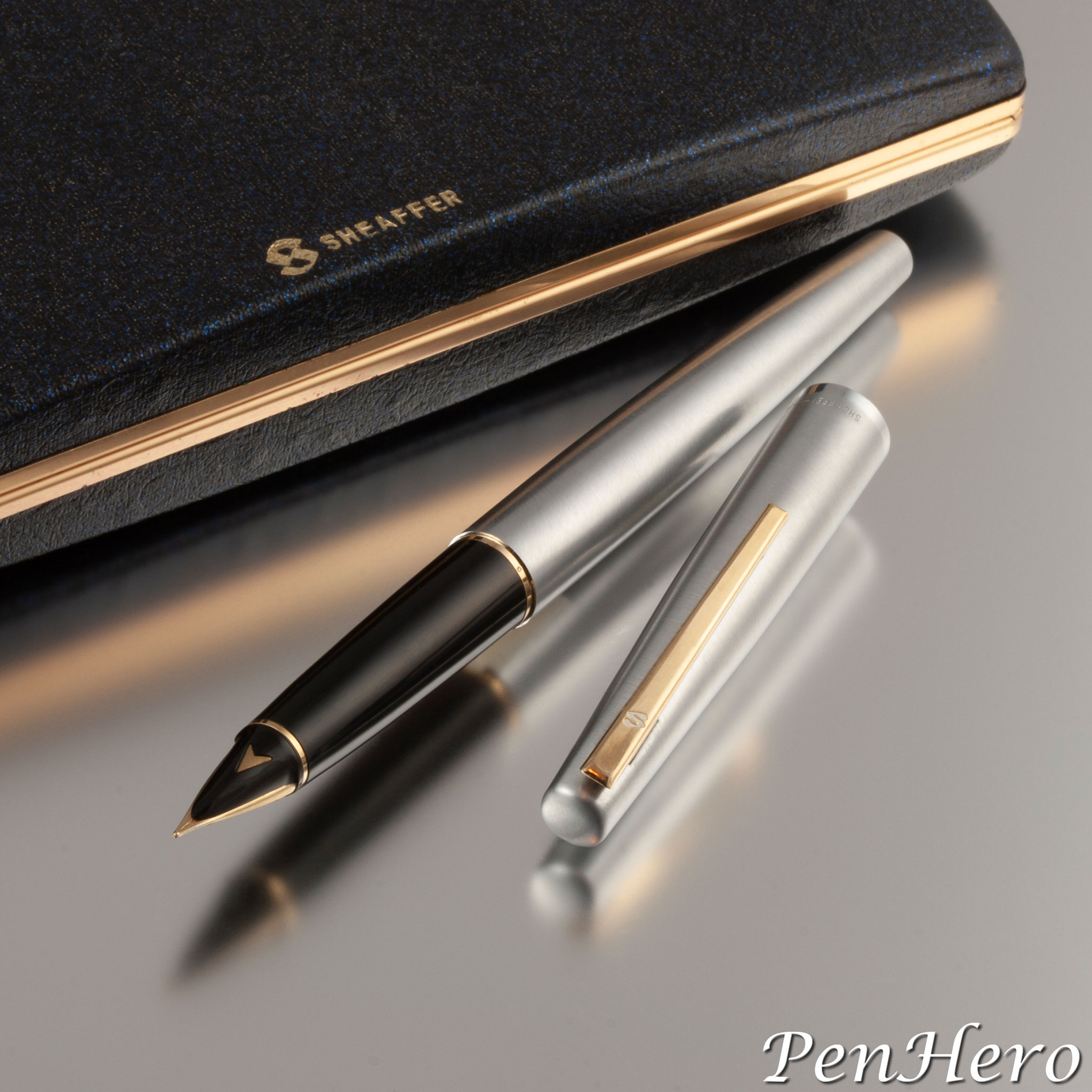
It’s not every day you get to open up a pen set that looks very much like the day it was for sale in the store. The Stylist is an interesting side road in Sheaffer's history. The fountain pen is the Stylist model 404C with a brushed chrome finish, “gold-tone” clip and two-way “dual point” nib unit. The set includes a push button converter and two cartridges each of the two cartridge pens. The “foursome” set includes a Glideriter felt tip pen that uses replaceable “Flourocarbon” felt tips, one replacement tip is included, and it is refillable with Sheaffer Skrip ink cartridges. The ballpoint pen has a press clip action Sheaffer patented and trademarked as “Safeguard.” The mechanical pencil is a twist type.Read the story about these interesting pens here!
Conklin Pearl and Gold Mosaic Fountain Pen c. 1937-1938
The Conklin Pearl and Gold Mosaic fountain pen is about 5 inches long and had a retail price of $3.00 in the 1937 Conklin dealer brochure. It's only other known appearance in print is in one wholesale catalog. The celluloid brickwork wraps around the pen in a spiral to form the cap and barrel tubes and shows many shades of shimmering brown, pearl and gold. The spiral design is similar to the one shown in design patent D96,888 awarded September 17, 1935 to Andreas Bienenstein, which was one of several designs for the flagship Nozac pens, in this case specifically for the Penline models. It's one of the most collectible Conklin lever fill pens of the 1930s.Read the story about this interesting pen here!
Conklin All American Sacless Vacuum Pen c. 1936-1938
The first sacless vacuum filling All American pens appear in the Conklin 1936 catalog. Although aimed at the moderate price market, the fit and finish of the Conklin All American Sacless Vacuum Pen matches the higher line Conklin products from the same year. The snakeskin celluloid on these pens is prized by collectors and came in three colors, Reptilian Pearl-Gray, Reptilian Gold-Green Vein, and Reptilian Foliage-Red Vein. The celluloid on the Conklin All American Sacless Vacuum Pen had large transparent patches in the pattern on the barrel, allowing the user to check the ink supply. Conklin added marbled gray, green, and red All American Sacless Vacuum Pens in the 1937 dealer brochure.Read the story about these interesting pens here!
Parker True Blues: True Beauties 1928-1931
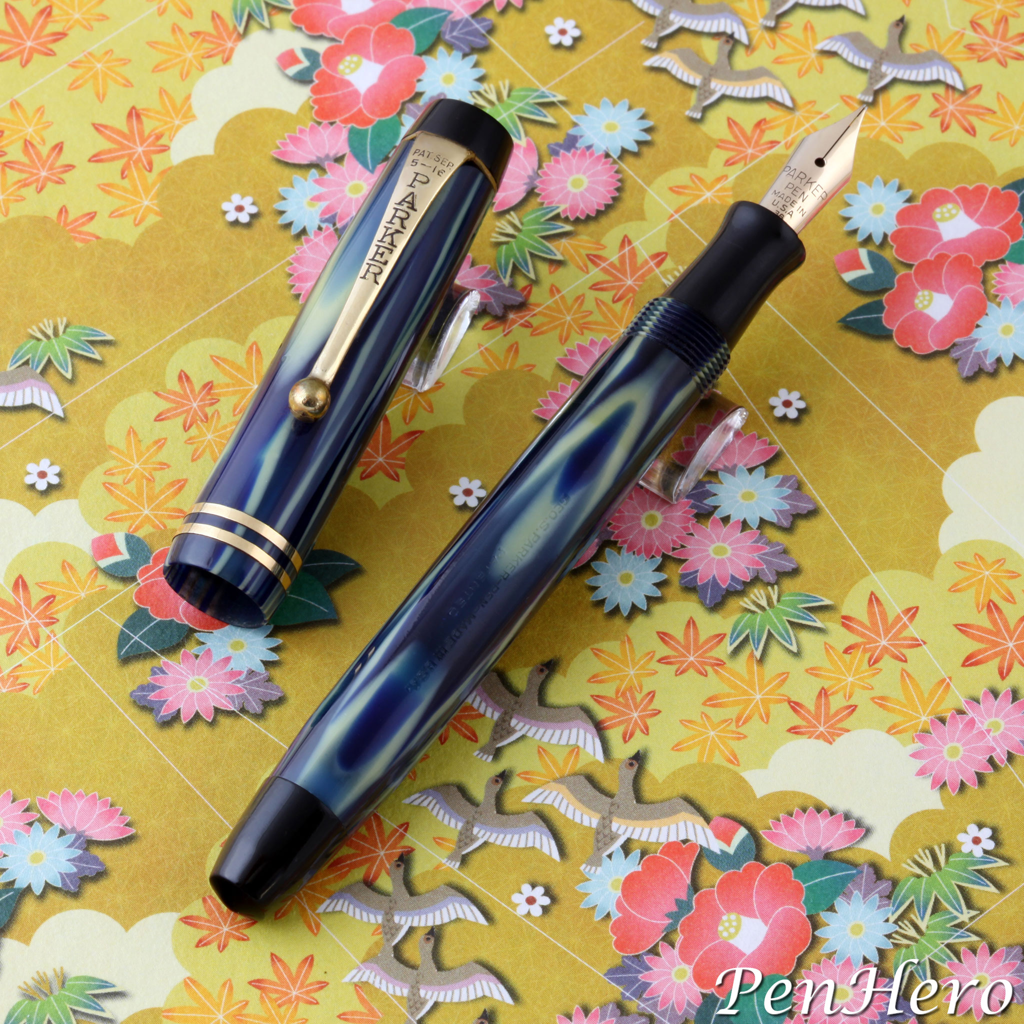
Parker announced a new line of slender pens and pencils with marbled dark and light blue with white Permanite celluloid school to their retailers in the July 1928 Parkergrams. As with the previous smaller size lines, these new pens and pencils followed the design of the larger Parker flattop Duofold line and came in clip (“long”) and ringtop (“short”) versions. Parker called the new pens the "Three-Fifty" in early company advertisements and in the 1929 Parker catalog. The name derives from the $3.50 price for either of the two fountain pens, while the pencils sold for $3.00. The marbled color was called "Modernistic Blue" in 1929 advertisements and in the 1929 Parker Catalog and "True Blue" in 1930 advertisements and in the 1930 Parker Catalog. Collectors today generally refer to these pens and pencils as “True Blue.”Read the story about these interesting pens here!
BIC Vermeil Silver Anniversary Pen c. 1975
There are five known versions of the BIC Silver Anniversary pens: three all metal pens with the cap and barrel made either of sterling silver, vermeil (gold plate over .925 sterling silver), or solid yellow gold (unknown gold content), and two with non-metal barrels, a briar wood (radica wood) barrel version with a .925 sterling silver or vermeil cap and trim pieces including the BIC logo on the barrel and the barrel end cap, and a plastic Cristal version with a .925 sterling silver or vermeil cap. It's unknown how many of each type were made. Since the last update more information has become available. Cristal Silver Anniversary pens come in boxes marked CRISTAL over ARGENTO .925% and CRISTAL SILVER over ARGENTO .925%. I've seen no evidence that any of the Silver Anniversary pens were made for retail sale.Read the story about these interesting pens here!
Wahl Engine Turned Design Gallery 1919-1929
This is a companion article to the PenHero article, "Wahl Engine Turned Designs on Fountain Pens Guide 1919-1929." That article is a more detailed chronology of the engine turned and machine engraved designs the Wahl Company used on their Tempoint (1918 to at least as late as 1920) and later Wahl branded fountain pens. It includes model numbers and prices, if known. This article is organized where the designs are in alphabetical order and is focused on photos and illustrations of each. Each section describes a design, when it was made, generally what pens it was used on (the pens themselves were updated over the eleven year period), the metals of each pen, and representative photos or illustrations to show each design.Read the story about these interesting pens here!
Wahl “Champlevé” Pens c. 1928
The Wahl Company experimented with a decorative technique known as champlevé in the late 1920s and made several prototypes that can be seen in Jonathan Veley’s book, Eversharp, Cornerstone of an Industry. As he points out in his book, champlevé has a specific definition that Wahl did not completely adhere to. Traditional champlevé is “a decorative technique that fuses a powdered glassy material into a recess in a metal surface through the application of heat,” according to the article “Champlevé Enameling” by Medill Higgins Harvey, Moira Gallagher, and Anne Grady of the Metropolitan Museum of Art. The known Wahl pens with a "champlevé" design are actually the opposite effect.Read the story about these interesting pens here!
Wahl Engine Turned Designs on Fountain Pens Guide 1919-1929
Did you ever pick up a Wahl metal fountain pen and wonder what the design was called, when it was made, and what pens it was used on? This guide takes the available catalog and advertisement information and formats it into a table of engine turned and machine engraved designs that appeared on Wahl and Tempoint fountain pens from 1919 through 1929, a description of each, a table of when they were made, and a detailed year by year chronology of what was made and when. There are quite a few gaps in the available data, which is called out in the article, but it's intended to help you figure out what is that Wahl pen you are holding.Read the story about these interesting pens here!
Wahl Eversharp Hanlin Design 1920-1925
The Wahl Eversharp Hanlin design is a rare example of combining engine turned and hand engraving on the same writing instrument. Hanlin is a variation of the Ribbon or Colonial linear machine engraved design with panels of straight lines running the length of the cap and barrel divided with wide blank panels that are hand engraved with an ornate flower and foliage design. Design credit was given to John H. Worthy and Clarence W. Lund in the April 25, 1921 design patent application which was awarded on September 13, 1921. The patent only shows the design on a pencil but was obviously extended to fountain pens as well. It’s not clear from the application or the few Wahl documents I have how the pattern came to be named Hanlin. Solid gold pencils with the Hanlin design were already in production in 1920 before the award.Read the story about these interesting pens here!
Wahl Eversharp Air-lite 1939-1941
The Wahl Eversharp Air-lite served as the entry level "back to school" pen with the Eversharp name, making it's prom debut in 1939 and bopping along through about 1941. The pen was a notch down from the Pacemaker, which was an attractive and less expensive alternative to the premium priced Coronet. Like the Pacemaker, the Air-lite was offered in striped celluloid and black and was fitted with a smooth writing 14 karat gold nib. The Air-lite has a simpler clip with "silvery" trim, possibly rhodium or chrome plated, as on contemporary Eversharp pencils. It was the company’s lowest price point pen, taking that spot from the previous year’s Junior model.Read the story about these interesting pens here!
Parker Duofold Greenwich Special Edition 1999
The Parker Duofold Greenwich is a 1999 special edition fountain pen and rollerball pen created to celebrate the new millennium of January 1, 2001 through December 31, 3000. The pen commemorates the Royal Observatory in Greenwich, England, where one can stand on the Prime Meridian Line where in 1884, zero degrees longitude was established and from that, all distances east and west were then measured. Local tradition is the Prime Meridian at midnight is when each new day begins. Parker was the only pen company licensed to produce an official Greenwich pen and use the Royal Observatory Greenwich logo to mark the Millennium celebration.Read the story about these interesting pens here!
Cascade Hoodpoint Fountain Pen 1950-1952
This Cascade fountain pen came along with several other cheapies as part of a “bag ‘o pens” deal and has been sitting in a storage box waiting for a look. Having just last year dug into Criterion pens and discovering they were a Rexall brand, I thought, why not look up Cascade and see what happens? Sure enough, every advertisement with these pens is by a Rexall store or Rexall itself. Cascade as a fountain pen brand is first seen in Rexall retailer advertisements in 1934, but this pen shows up first in 1950.Read the story about these interesting pens here!
Moore Fingertip 1946-1948
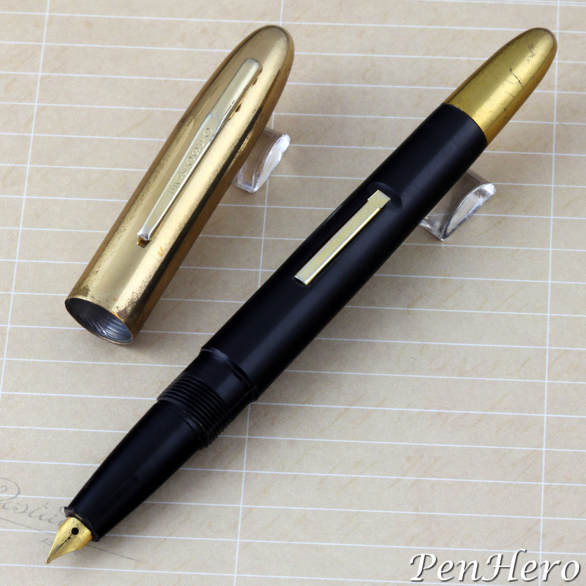
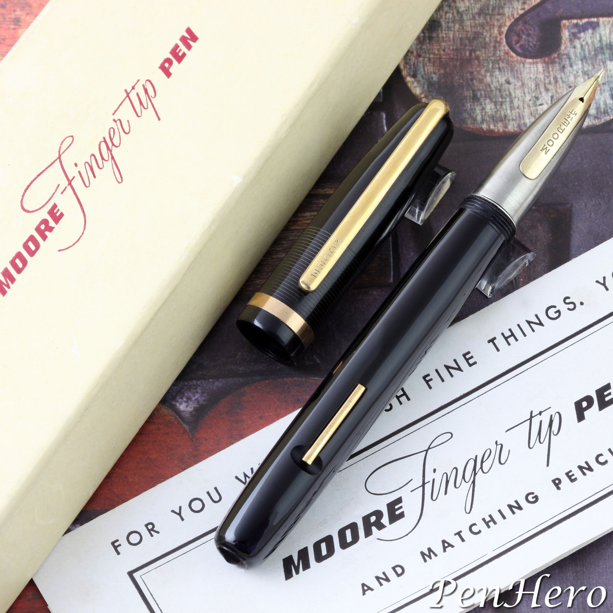
Though the Moore Fingertip is an obvious a design response to the market leading Parker 51 and Sheaffer Triumph, its design is different enough to be viewed on its own merits, copying very little from the design leaders, but taking obvious cues from them. As is typical with Moore pens up to that date, it’s generally a well-made lever fill pen with one unfortunate and deal killing problem. This stems from the most notable element, its namesake Fingertip section, a bullet shaped nugget of solid stainless steel with the gold nib inset flush on top, like a fingernail. There is literally no other pen quite like it.Read the story about these interesting pens here!
An Uncatalogued Bexley Tuck-Away Mardi Gras Fountain Pen c. 2004-2008
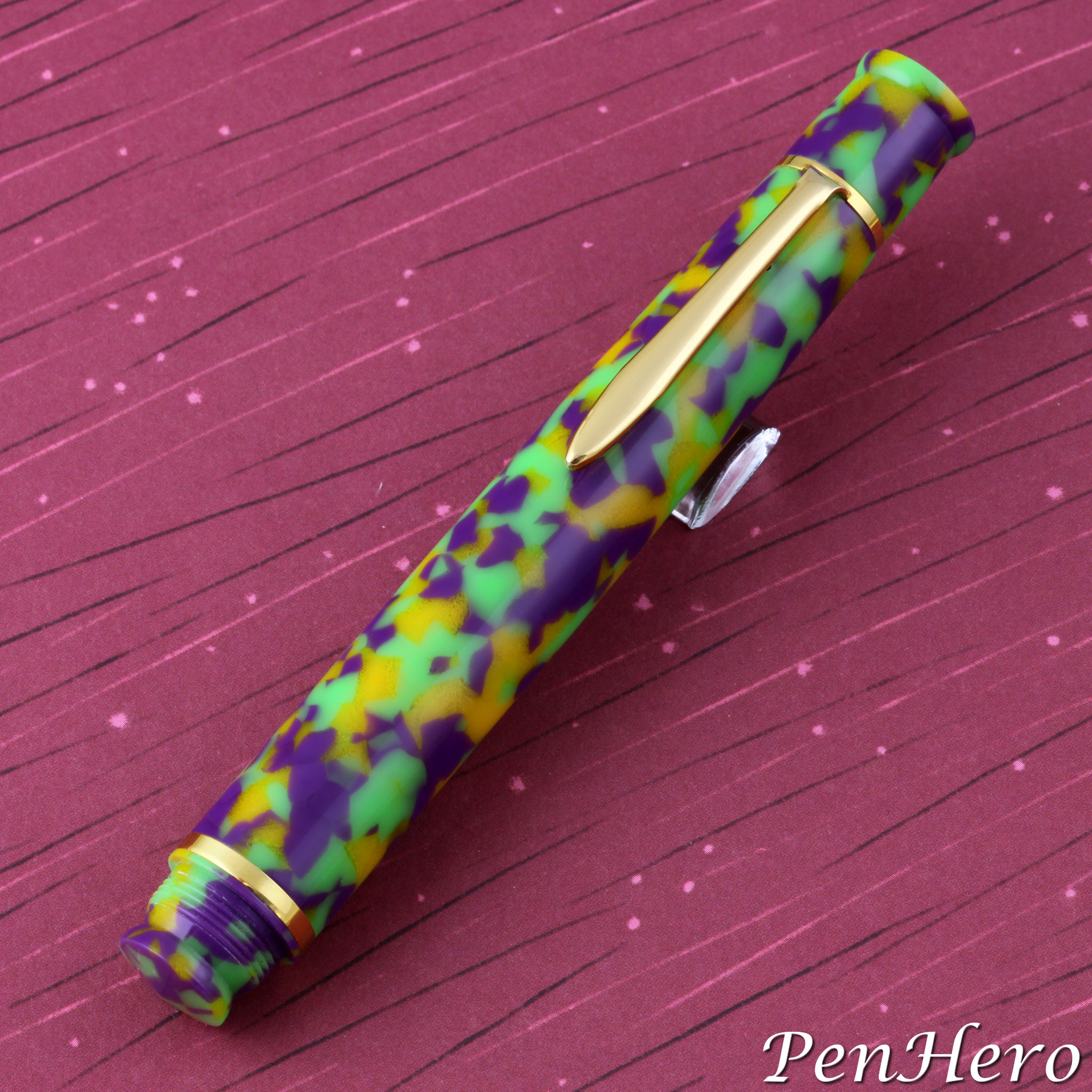
The Bexley Tuck-Away is a “long-short” style pen that is only 4 1/4 inches long capped but with the cap threaded onto the end of the short barrel it becomes 7 1/2 inches long posted. It was made in both fountain pen and rollerball pen versions and due to the compact size of the barrel the fountain pen can only accept short international cartridges. No converter was provided even as an option. This uncatalogued Bexley Tuck-Away is made of a colorful version of the Cracked Ice acrylic resin called Mardi Gras, a mix of green, purple, and orange.Read the story about this interesting pen here!
Eberhard Faber Permapoint Fountain Pen 1941-1948
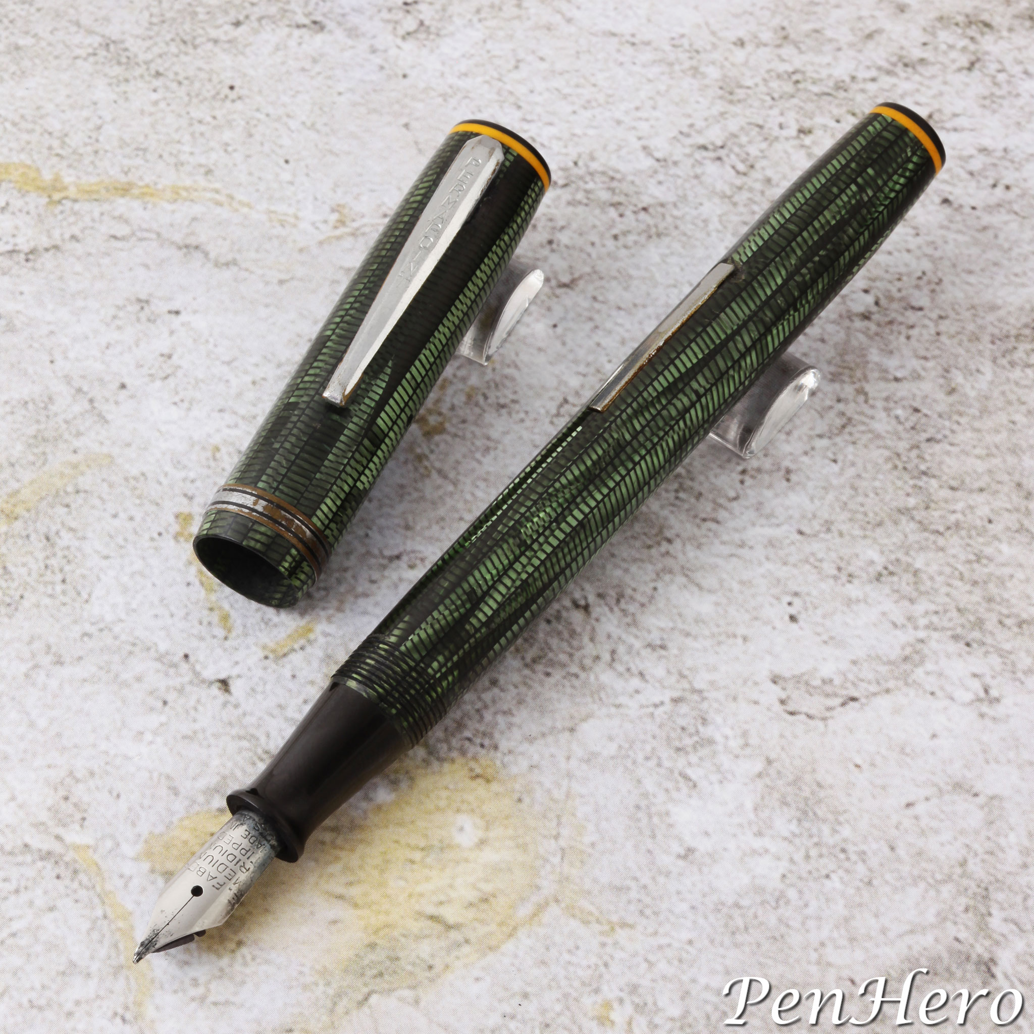
This story begins with a bent nib Eberhard Faber Permapoint fountain pen in green brickwork celluloid c. 1941-1948 that was at best a parts pen. I sold it and a black one thinking they were cheapies and not realizing they had a story. The pen shown above is a 5 1/16 inch long lever fill pen with chrome or rhodium plated trim. The clip is stamped PERMAPOINT. The stainless steel nib is stamped E. FABER over MEDIUM over IRIDIUM over TIPPED over MADE IN over U. S. A. The barrel is stamped PERMAPOINT over EBERHARD FABER U. S. A. over U. S. PAT. 124,266. My later curiosity about it led me down a rabbit hole to find out more.Read the story about these interesting pens here!
Gallery of Uncatalogued Lady Sheaffer Fountain Pens c. 1968–1971
As with the earliest Lady Sheaffer’s from 1958–1966, Sheaffer made a small number of uncatalogued versions of the 1968–1971 pens. Were these production, prototype, or short-run models? The fit and finish on them suggests they may have been special order pens but lacking any Sheaffer catalogs or price lists from that period, there’s no way to be certain. There are three known uncatalogued Lady Sheaffer models from this period. It is possible there are more. Each follows the design of the 1966-1968 Stylist, with a long, slender, tapered shape, and a long spring loaded clip.Read the story about these interesting pens here!
Lady Sheaffer Long Clip White Dot Fountain Pens c. 1968–1971
The Sheaffer ‘S’ logo, introduced on the clips of Sheaffer Stylist pens in early 1966, had a short life, with Sheaffer returning to the White Dot in the fall of 1968. This would also affect the appearance of the Sheaffer 'S' logo clip Lady Sheaffer pen models introduced in the fall of 1967. In the fall of 1968, Lady Sheaffer pen clips would be adorned with the White Dot in place of the ‘S’ logo and would have a short conical nib in place of the Stylist type. In addition, Sheaffer introduced three new finishes to the Lady Sheaffer line, described in advertisements as “satin silver with wave band,” “scalloped,” and “golden moiré.” These new finishes introduced a change in model numbering from Roman numerals to three digit numbers.Read the story about these interesting pens here!
Lady Sheaffer ‘S’ Logo Long Clip Fountain Pens c. 1967–1968
The original, clipless Lady Sheaffer fountain pen had a pretty good run, introduced March 20, 1958 with nineteen cartridge only fountain pen models in a wide variety of finishes priced from $10 to $110. The launch was supported with a big advertising and promotional campaign. Over the next few years some of the original models were phased out and in 1962 Sheaffer added two final new clipless models, each with an inset gold Stylpoint nib section. By 1966, the Lady Sheaffer line was due for a refresh The Lady Sheaffer fountain pen was redesigned for release in 1967 and followed the look of the Stylist in its cap and barrel shape, ‘S’ logo clip, and Stylist nib.Read the story about these interesting pens here!
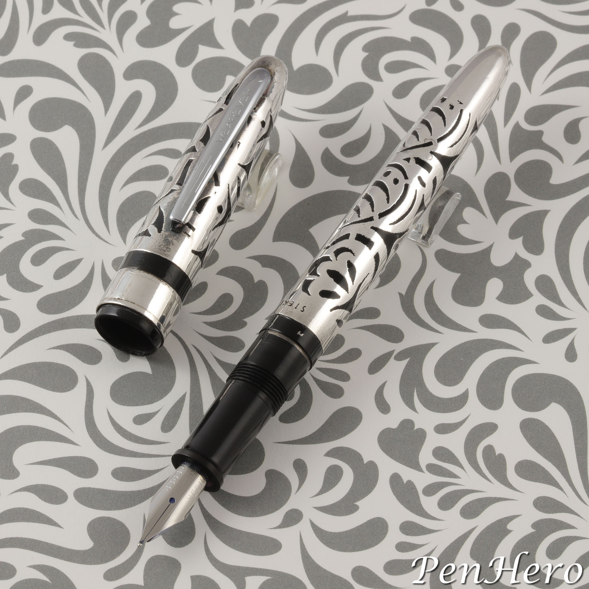
Wearever Sterling Silver Overlay Cartridge Fountain Pen 1969
This is a pen that is often described as the “Wearever Grail Pen” and like many uncommon pens has a bit of folklore attached to it. There are Wearever collectors who have or hope to have one. Hopefully I can clear up some of the story, but there are things that are just lost to history. I’ll present the facts that I could find and try to fill in the rest with intelligent guesses. Based on the packaging, this was a specialty version of one of David Kahn, Inc.’s Wearever cartridge fountain pens from the 1960s. It resembles a black plastic cartridge version of the Wearever Supreme with a sterling silver overlay. These were probably only made for the 90th Anniversary Woolworth’s Stockholder’s Meeting, making them a special order item that may not have been made before or since. It was probably only made in black and probably had no matching pencil.Read the story about these interesting pens here!
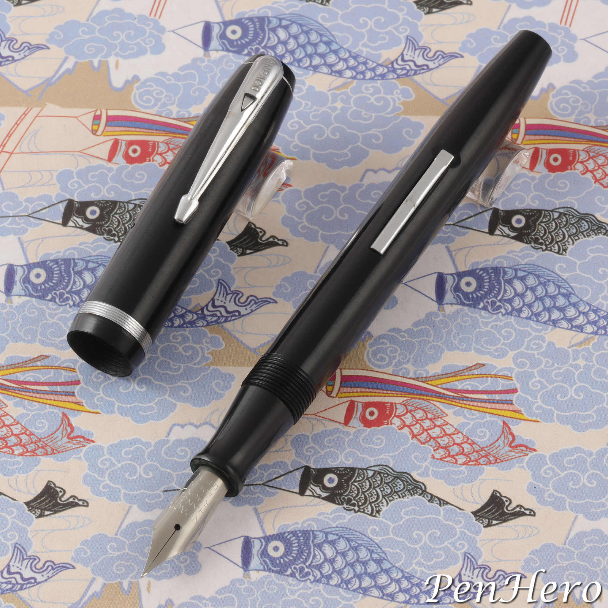
A. N. Palmer Anpaco Fountain Pen c. 1945-1949
Another week and another pen mystery solved! This is a specialty OEM version of a late 1940s Eagle fountain pen for the A. N. Palmer company for use with the Palmer Method. It was probably only made in black and likely had no matching pencil. The emphasis on "hand ground" stamped on the nib indicates that it was likely a special nib grind which would account for the higher price over an ordinary Eagle fountain pen with a stainless steel nib.Read the story about these interesting pens here!
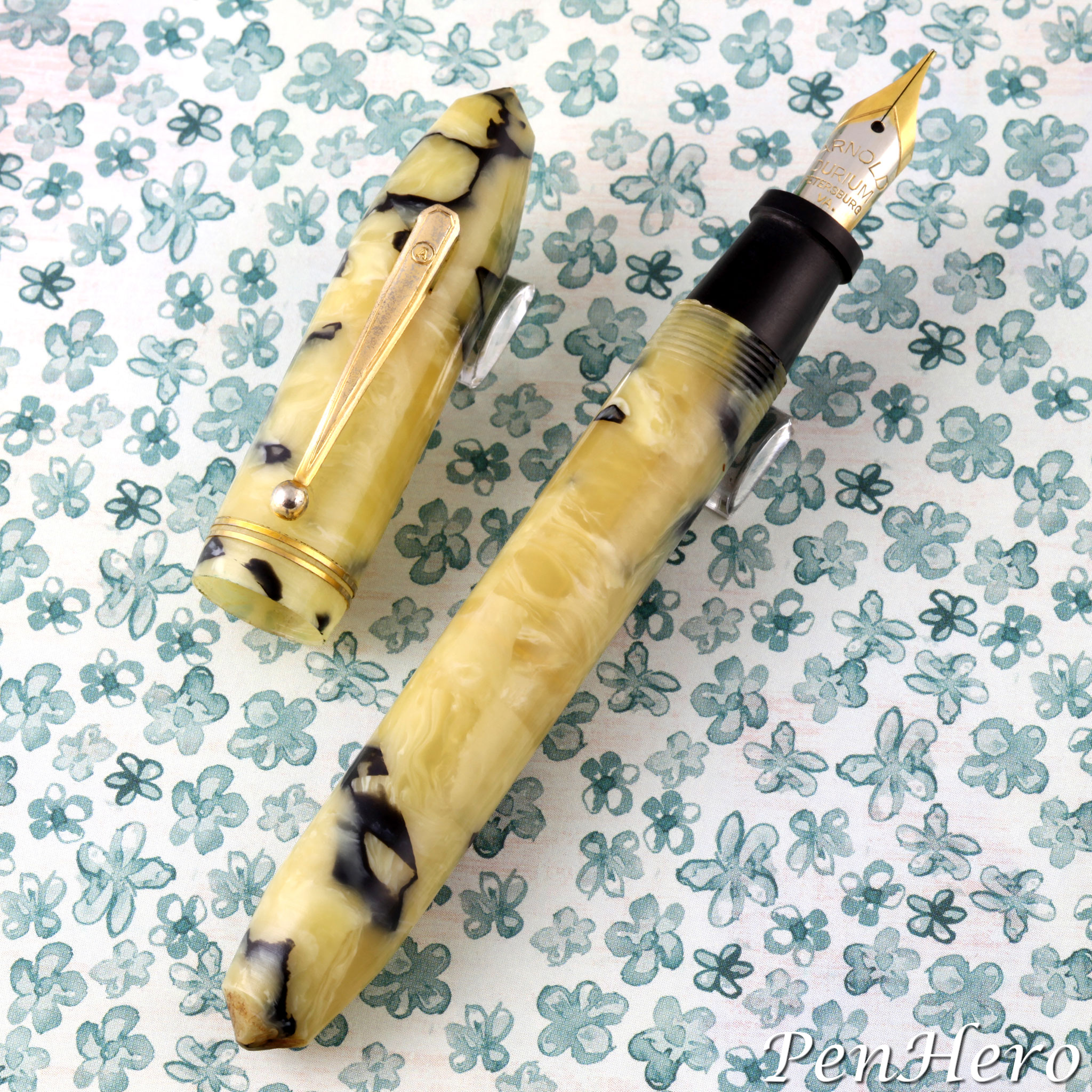
Early Arnold Fountain Pens c. 1935-1939
Was Remmie Arnold the King of the Cheapies? Did the Arnold Pen Company make anything worth collecting? The answers may surprise you! If Remmie Arnold, founder and owner of the R. L. Arnold Pen Manufacturing Company, was to tell his own life story, it would sound a lot like his profile given in Virginia newspapers when he was running for the Democratic nomination for the 1949 Virginia governor’s race. Each telling was like a “Horatio Alger rags to riches story,” as if written by a New York agency. From a lowly beginning, Arnold started his career as a clerk at the Edison Pen Company in Petersburg, Virginia. After twenty years learning the pen manufacturing business, he rose to be the company’s general manager and president. He left Edison in 1935 at the age of 41 and founded his own namesake pen company and launched a career of making and selling low price, low cost pens by the thousands to major retail chains and advertising companies. By 1942, the Arnold Pen Company was the second largest manufacturer of pens and pencils in the world, by volume. But are there any collectible Arnolds?Read the story about Remmie Arnold and his early pens here!
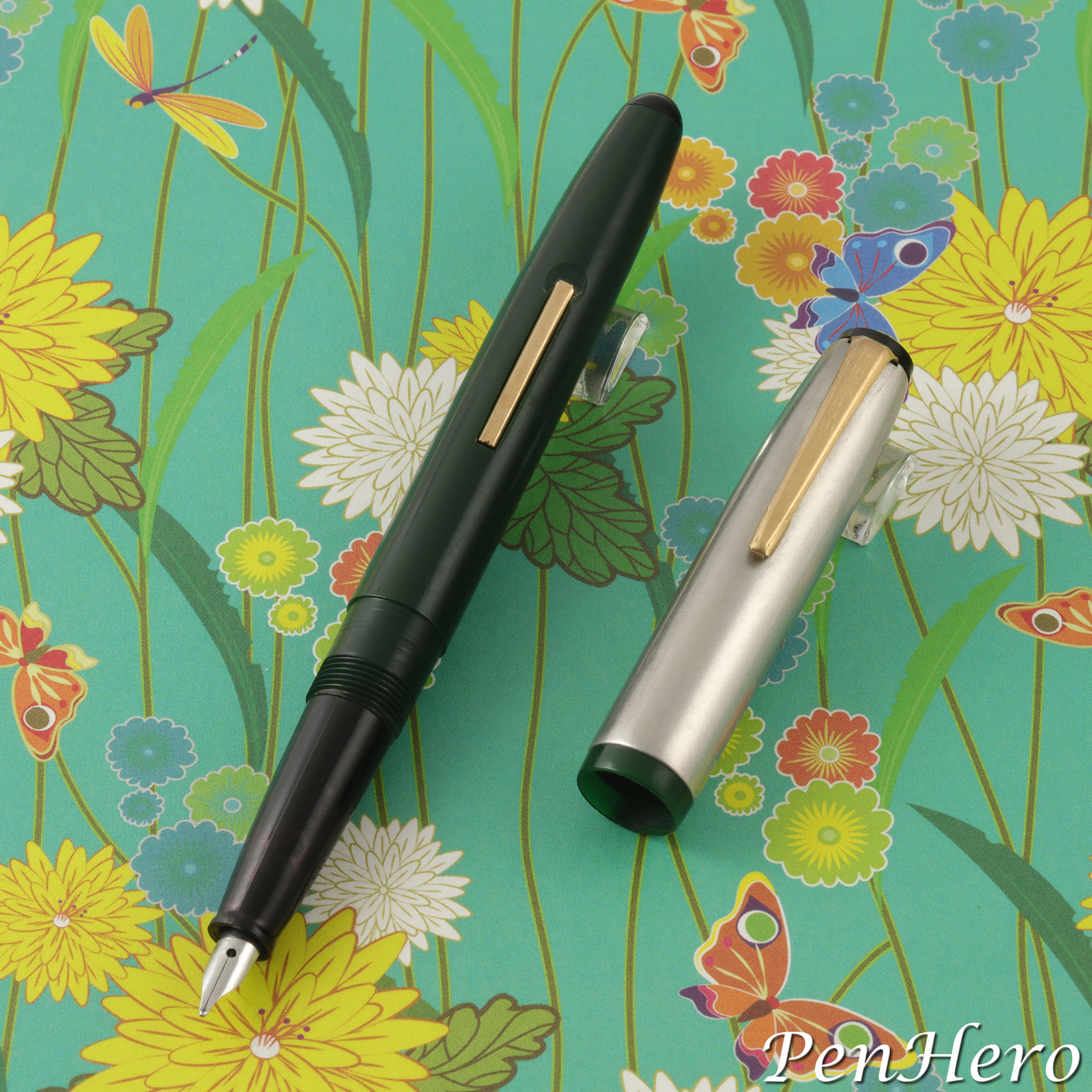
Wearever De Luxe 1947-1949
This third version of the Wearever De Luxe will cause a double take as it looks so much like the Pennant. It's a lever-fill pen with an injection molded plastic barrel and inner cap. The cap has a satin finish stainless steel sleeve, giving it the appearance of having a metal cap. The cap top and section are black plastic. The section is tapered similar to a late 1940s Waterman Taperite fountain pen and has a small unmarked stainless steel nib. The clip and lever are gold plated. It’s not known how many colors or nib sizes were made, but it’s likely they are the similar colors as the earliest Pennant, in darker shades of maroon, green, navy, and gun metal. The plastic used to make the Pennant was described in David Kahn, Inc. advertisements as Forticel, made by the Celanese Plastic Corporation.Read the story about this interesting pen here!
Wearever Pacemaker 1955-1959
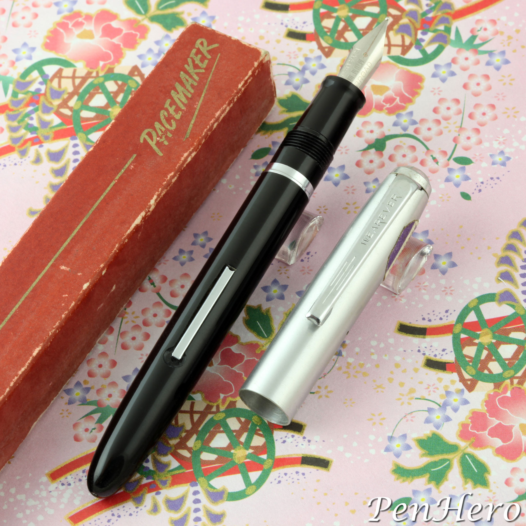
The 1955-1959 Wearever Pacemaker has a similar look to the Pennant but is a bit more “refined.” The barrels came in five colors, Blue, Maroon, Green, Grey, and Black, and some examples have matching color sections. It has an all metal, satin finish, silver color cap and a silver color metal cap top, clip, lever and trim piece on the section. These may all be made of stainless steel, but it’s not stated as such in any advertisements. I personally think they are. There are six exchangeable “Replace-A-Point” threaded nib units. This feature was similar to Esterbrook’s system, but the nibs are not interchangeable. The pen alone sold for $1.95 and for $3.25 with a matching twist action pencil.Read the story about this interesting pen here!
Parker 61 Jet Flighter 1959-1962
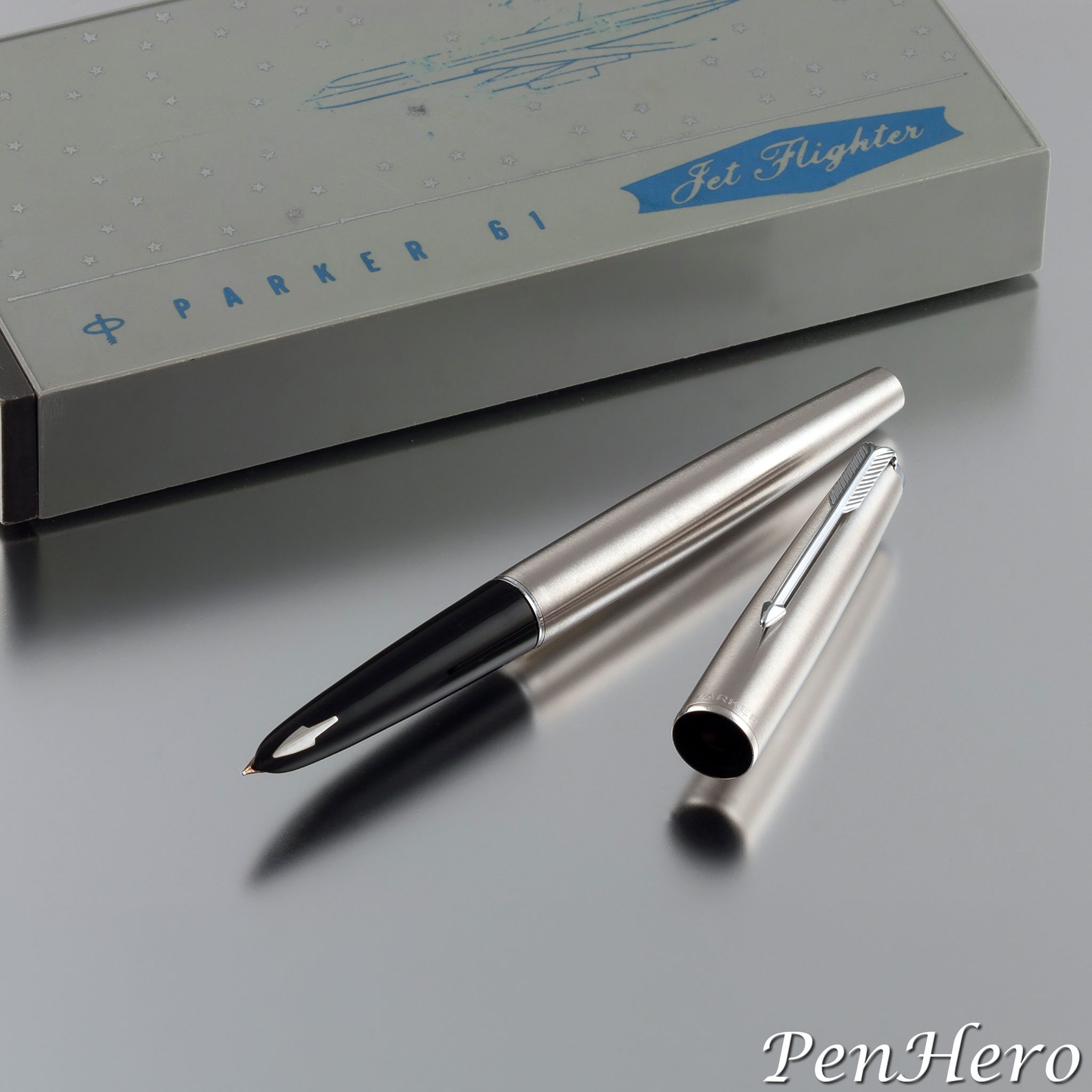
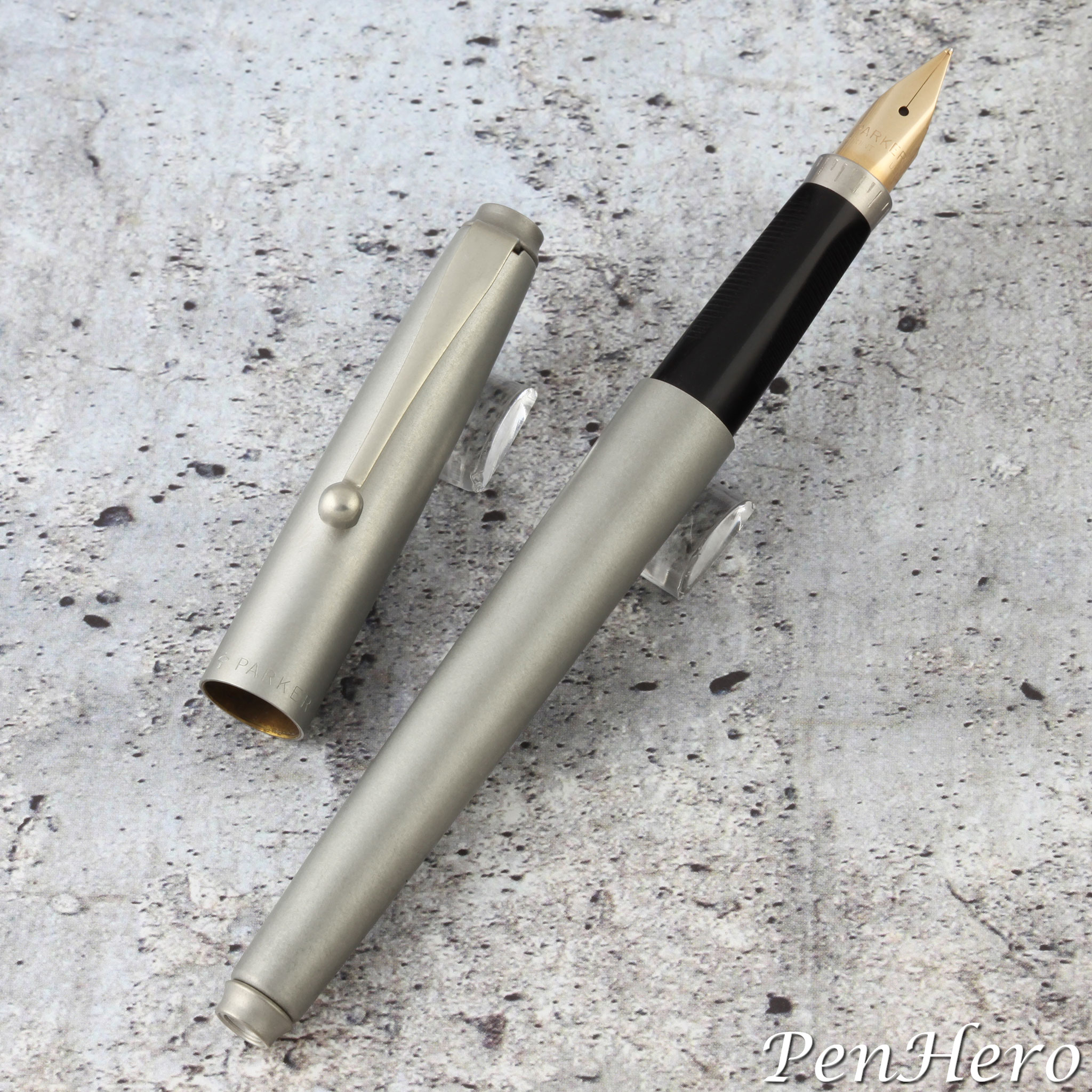
Inspired by the jet age, Parker introduced the 61 Jet Flighter model in 1959 with its cap and barrel made of "Lustraloy" brushed stainless steel, chrome plated trim, and fitted with a 14 karat gold hooded nib unit. It was packaged in a special box with graphics of the Jet Flighter name with a Douglas DC-8 silhouette. The 61 Jet Flighter is more angular, more tapered, and narrower than its 51 Flighter predecessor. Both the cap top and barrel end of the 61 Jet Flighter are fitted with gray plastic "jewels." The DC-8 was part of the new wave of American made jetliners and the association would tie the pen to high tech. Parker formally announced the new pen to retailers in the September 1959 Parkergrams U.S.A.Read the story about this interesting jet age pen here!
Victor Victapen Standard Size c. late 1930s
Up to now, many might think the c. 1932–1949 convertible compact Victapen purely as a small pen, sold with a matching pencil, where the two could be reconfigured into a 5 to 5 ½ inch long pen and pencil combo by removing the caps from the barrels of both the fountain pen and the pencil, putting the pencil point onto the end of the pen barrel, and replacing the pen cap back on. This example appears to be identical to the smaller Victapen except for size. Are there any more out there?Read the story about this beautiful pen here!
Sheaffer Triumph Masterpiece II c. 1945-1947
Sheaffer revised the Triumph pen and pencil line in 1945, making it more rounded, changing to a new clip design, changing the section, and adding a spring loaded mechanism to the clip. The update included a redesigned Triumph Masterpiece II pen and pencil shown in the 1946 catalog and the Masterpiece Stratowriter ballpoint pen was added in the 1947 catalog. The Triumph Masterpiece II continued in this form until Sheaffer began to install the White Dot in the cap and/or the Touchdown line was introduced. The Sheaffer Triumph Masterpiece II is a little shorter and less ornate than its predecessor. The cap is more rounded, complemented by a more rounded, spring loaded clip.Read the story about this beautiful pen here!
Sheaffer Triumph Masterpiece c. 1942-1944
What does the word "masterpiece" bring to mind? A dictionary definition would be, "a work of outstanding artistry, skill, or workmanship," and "an artist's or craftsman's best piece of work." A pen with that name would be expected to meet the very highest standards. It would have to represent the very best work of the pen company that offers it. There is very limited original documentation specific to the Sheaffer Triumph Masterpiece pen and pencil. Most of the reference material points to the time before and after the pen was offered, with a couple of direct Sheaffer documents confirming the pen existed in the Triumph line from at least 1942 and dealer advertisements offering the pen and pencil set through 1945.Read the story about this beautiful pen set here!
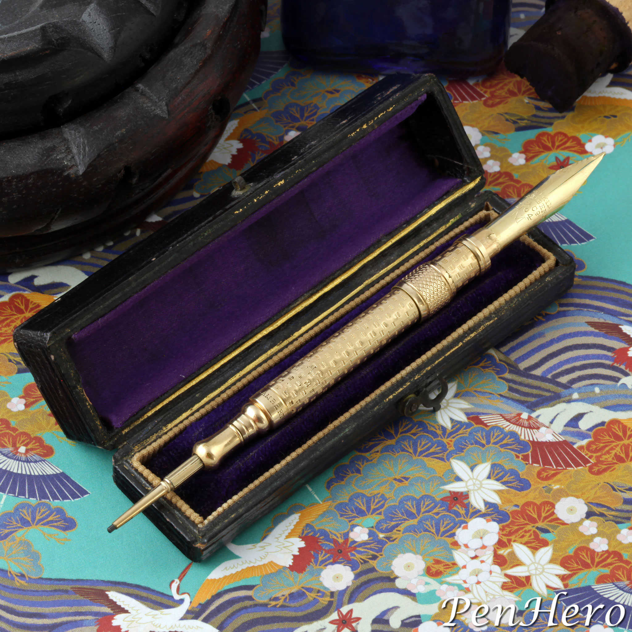
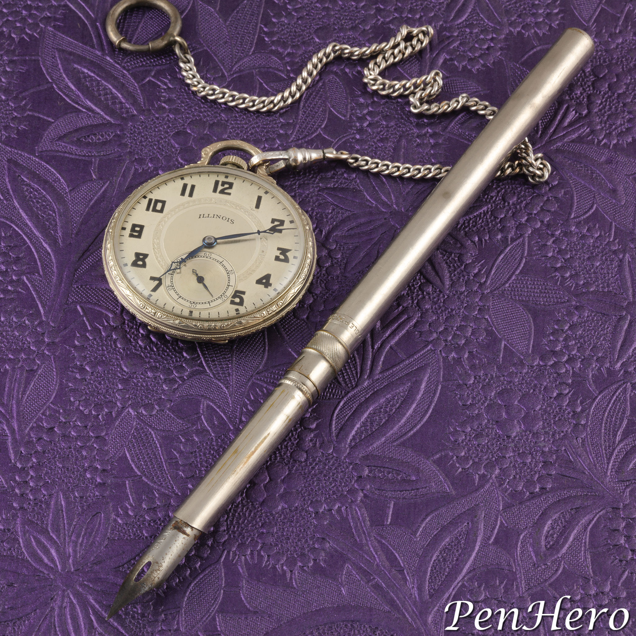
Aikin Lambert Combination Retracting Pen Holder and Pencil c. 1880-90s
A very interesting find made in a New Bern, North Carolina antique store several years ago. This is an Aikin Lambert combination retracting dip pen holder and retracting twist mechanical pencil c. 1880-90s, complete with the original box. Fully open, as shown, the instrument is 4 7/8 inches long. Closed, it's a tiny 2 11/16 inches long. The nib extends by pushing the knurled band on the barrel from the pencil end toward the open end where the nib is hidden. The nib slips onto a tab that holds it in place and is kept inside the barrel when not in use. The very flexible gold nib is stamped AIKIN over LAMBERT over & CO over No 4 over M, a medium flexible nib. The mechanical pencil extends by pulling it out from the barrel and the lead advances and retracts by twisting the knob near the tip where the lead comes out. A beautiful and complex tiny writing instrument that is as much jewelry as it is functional.Read the story about this interesting writing instrument here!
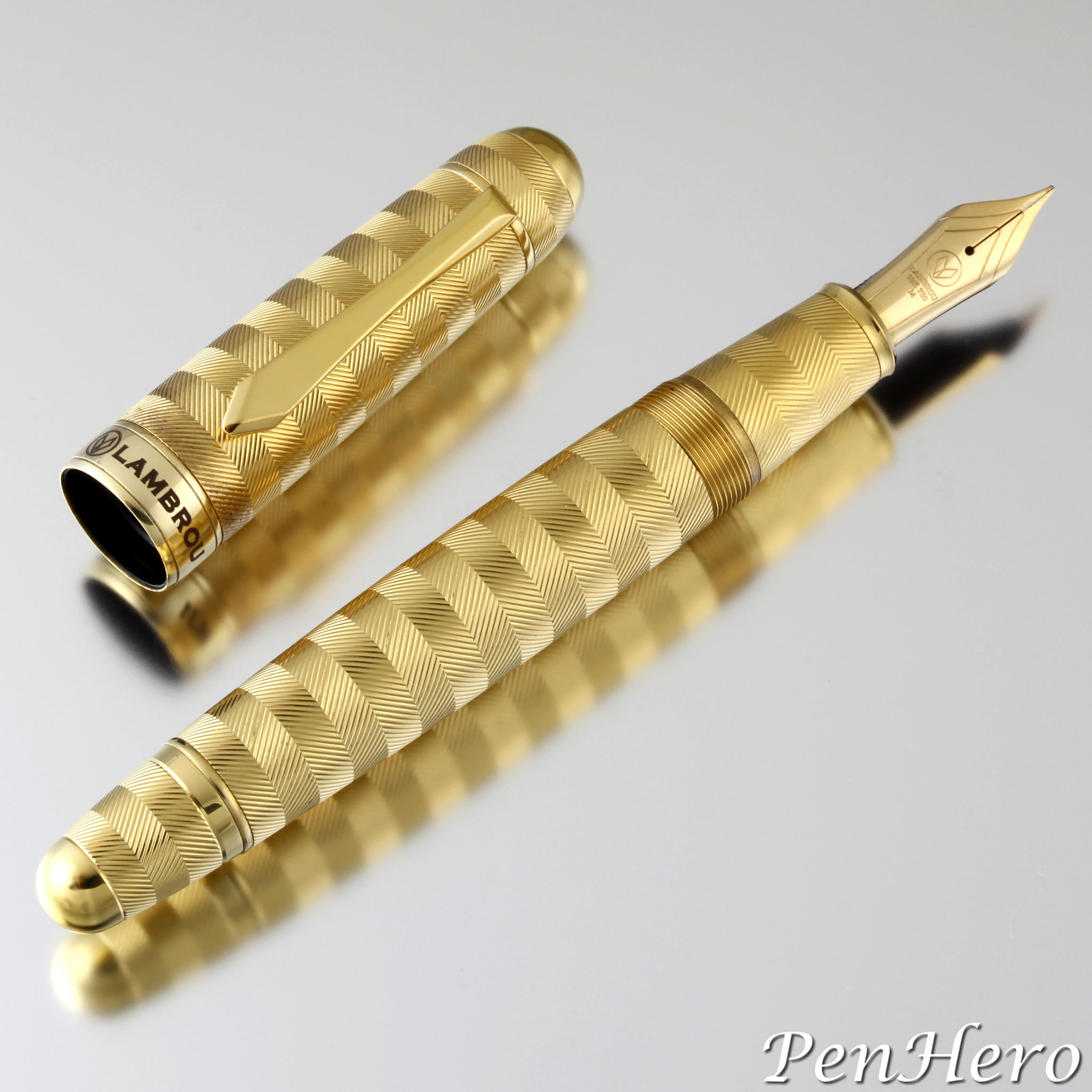
Lambrou Pens Mirage Prototype c. 2017
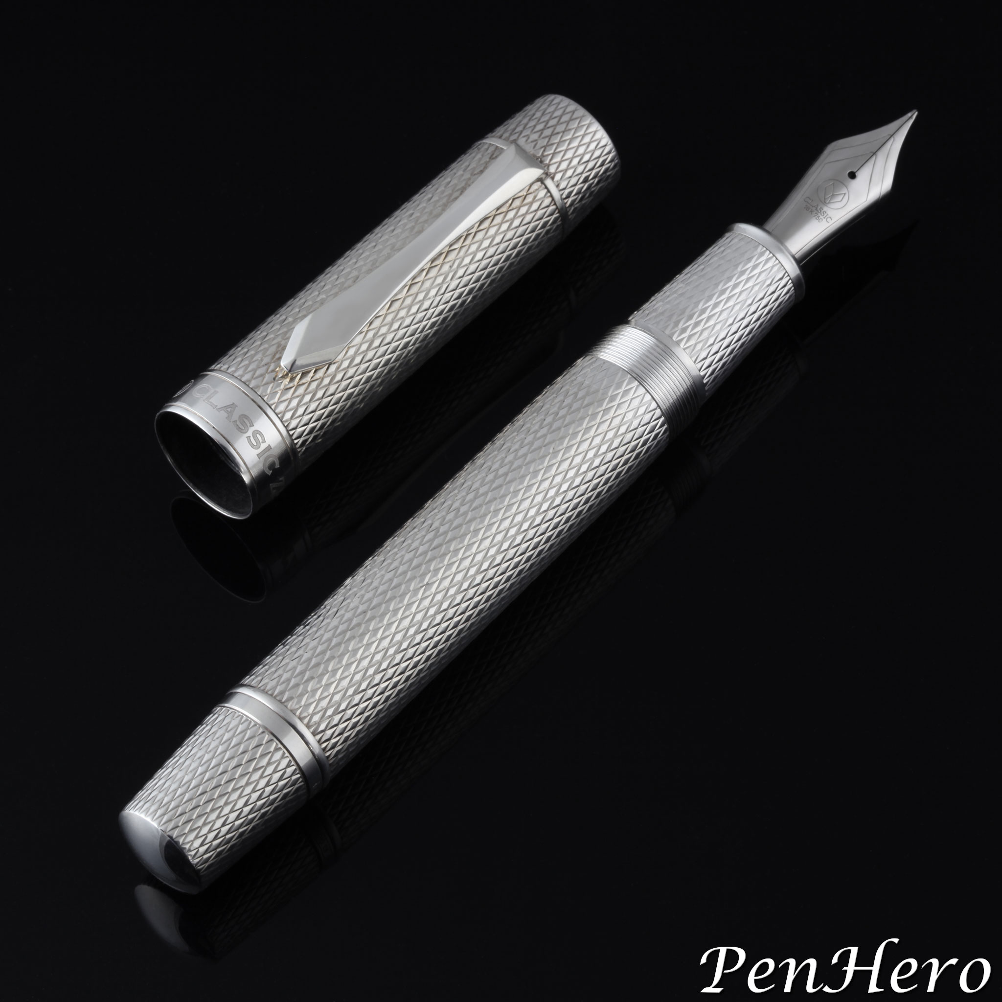
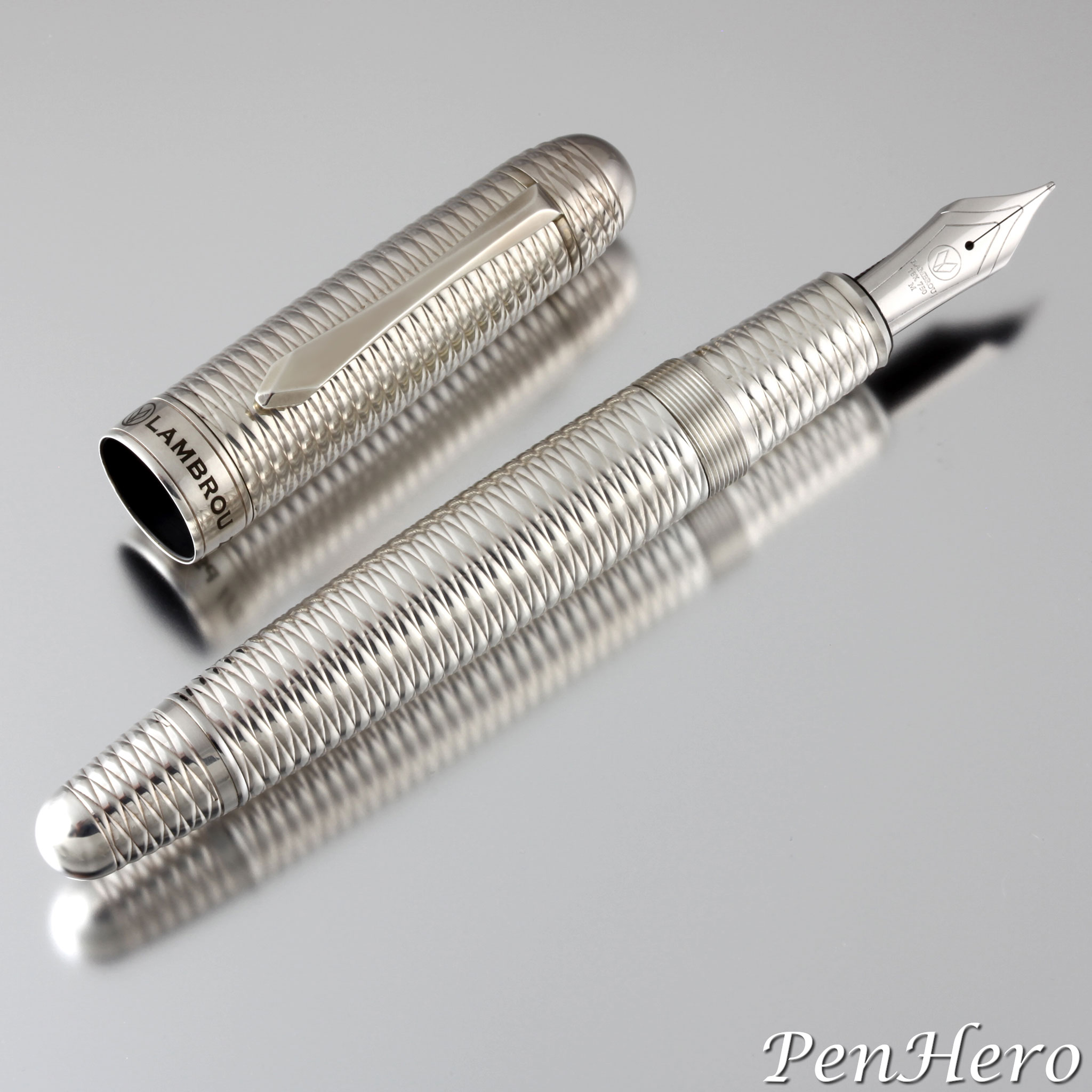
This is the Lambrou Pens Mirage prototype fountain pen made c. 2017. The mirage name comes from the alternating stacked engraved bands, each a deeply cut reeded edge, sometimes called “coin edge” that are cut at opposite 45 degree angles that create a strong contrast and emphasize each band. The geometric pattern does not have a formal name. Andreas Lambrou credited his assistant, Monica C Jimenez, for picking out this pattern for the prototype. The engraving was done on a modern computerized machine using brass blanks for each of the cap and barrel parts by the R. Murelli Company, an independent, specialty guillocheur workshop located in Domont, France.Read the story about this interesting pen here!
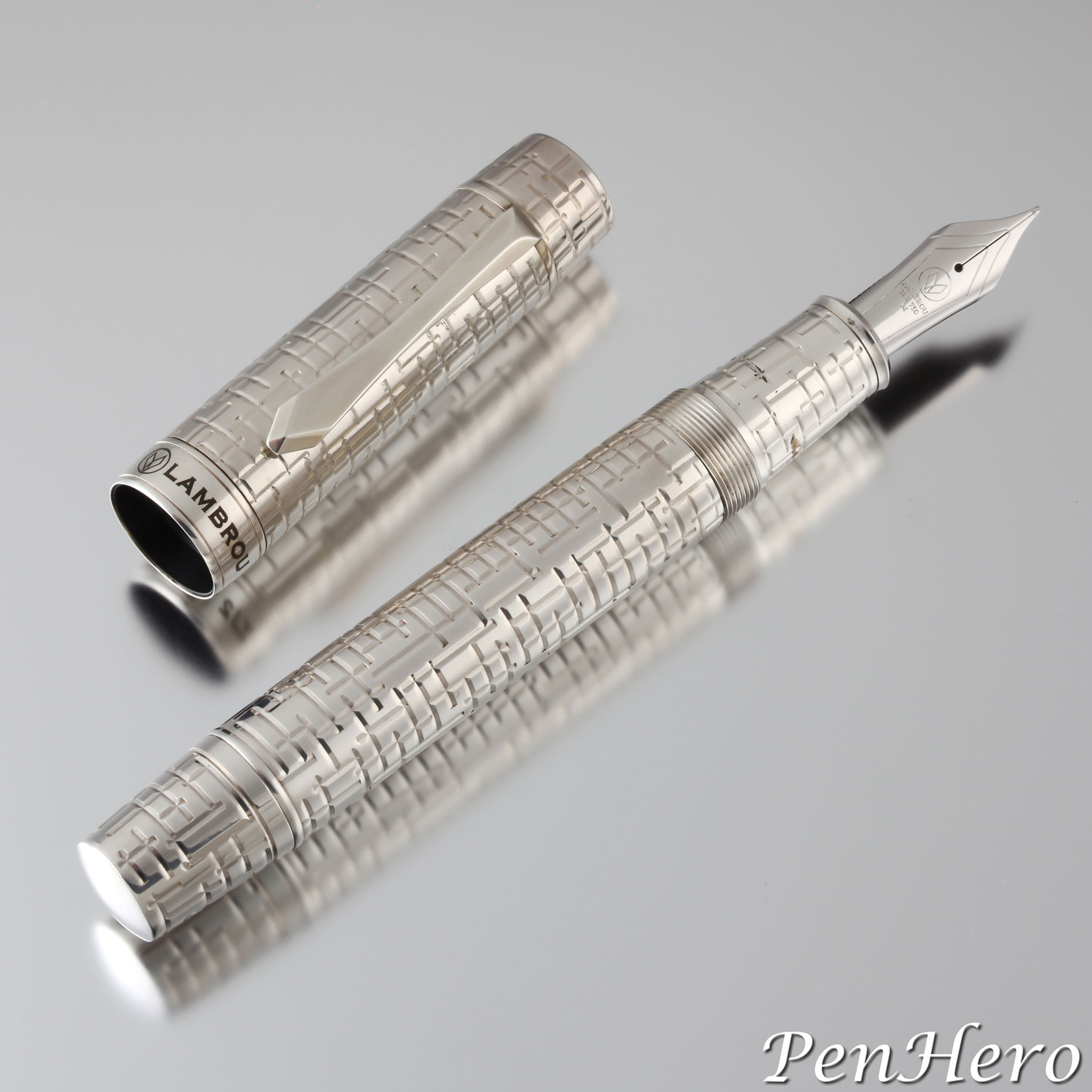
Lambrou Pens ZJ2 Gaia Prototype 2012
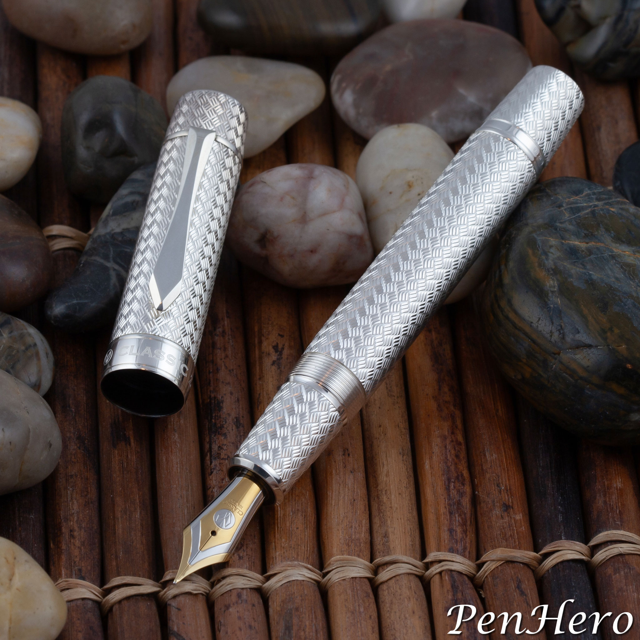
This is the Lambrou Pens ZJ2 Gaia prototype fountain pen made in 2012. Gaia or Gaea, in Greek, Γαία, is the ancient Greek personification of the goddess the Earth. Gaia was the mother of the Titans, the Gigantes, the Erinyes or Furies, and the Cyclopes. The guilloche engraving uses deep vertical and horizontal cuts crossing and meeting at right angles to represent the terrain where the decisive Battle of Thermopylae, between the small army of Spartan Hoplites and other Greeks against the huge Persian army invading Greece. The battle took place in 480 BC. The geometric pattern is otherwise unnamed. There is no direct connection between Gaia and Thermopylae, so the chosen names may simply be to tie the pen and design to elements of Greek mythology.Read the story about this interesting pen here!
Classic Pens ZJ2 Iliad Diamond Spirale Prototype c. 2009
The ZJ2 Iliad prototype is a 5 3/4 inch long cartridge/converter fountain pen based on the large size Lambrou Pens Mythos model 878. The diamond spirale design is intended to represent the strength, justice, and courage virtues of Achilles, the great Greek hero of the Trojan War and Homer’s Iliad. This ZJ2 Iliad silver plated prototype fountain pen gets the Iliad name because it is engraved with the same diamond spirale pattern as on the 1995 Classic Pens CP3 Iliad. This is the second in a series on ZJ2 prototype pens.Read the story about this interesting pen here!
Classic Pens ZJ2 Parisienne Vannerie Prototype 2009
This prototype is the Classic Pens ZJ2 Parisienne Vannerie, the follow-up to the ZJ1 Mozaique. Like the ZJ1 Mozaique, the design was intended to be engraved the entire length of the pen to the edges, taking advantage of the cylindrical shape with its flatter ends. This is very eye catching, as the design literally flows from end to end, as if running underneath the cap band, the clip washer and the barrel trim ring. The oversize cylindrical shape in this prototype also gives the cap top and barrel end cap a slight taper. It was also intended to fit an even larger nib size.Read the story about this interesting pen here!
Popura Ink Shut Off Eyedropper Pen In Chôshitsu Style c. 1930-1937
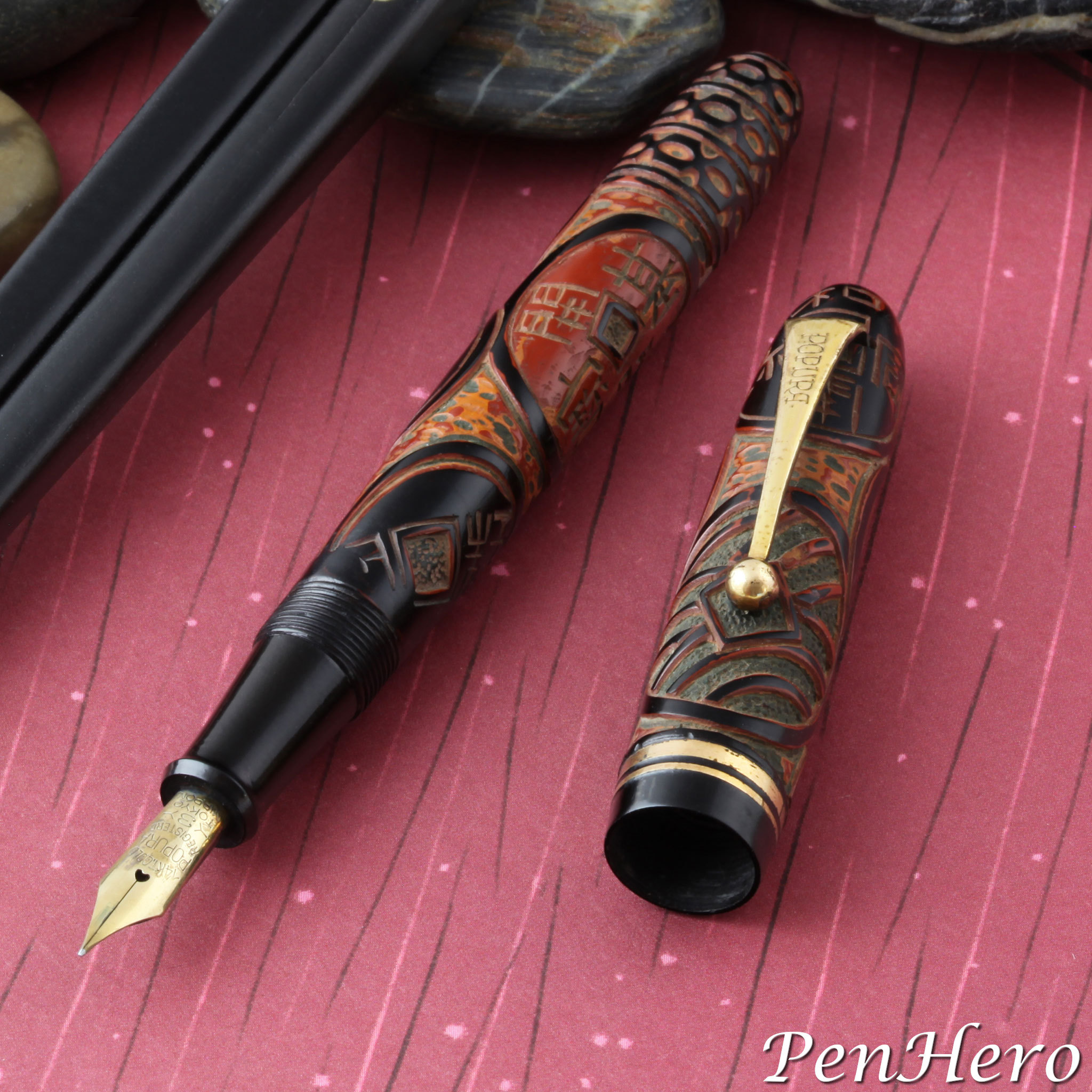
Popura is a less known, possibly obscure Japanese pen company that put a lot of effort into labeling their products with the brand name on clips, nibs and barrels. Since this article about this single Popura pen was published in 2017, more information has come available that fills in some of the missing parts of the story about the brand. This Popura ink shut off eyedropper fountain pen dates from about 1930 to 1937 because of the balance design and that it has a 14 karat gold nib without JIS markings. Unlike many pens from early small Japanese manufacturers that used rather generic hardware and trim pieces, this pen has branded metal parts. The gold plated clip is stamped with the brand name POPURA in a distinctive font. The nib is also stamped with the Popura brand along with full details: 14KT. GOLD over POPURA over REGISTERED over 3 over TOKYO over NIPPON. It’s not known if the company made their own nibs or, more likely, bought them with custom stamping.Read the story about this interesting pen here!
Lambrou Pens LN2 Harvest Prototype 2020
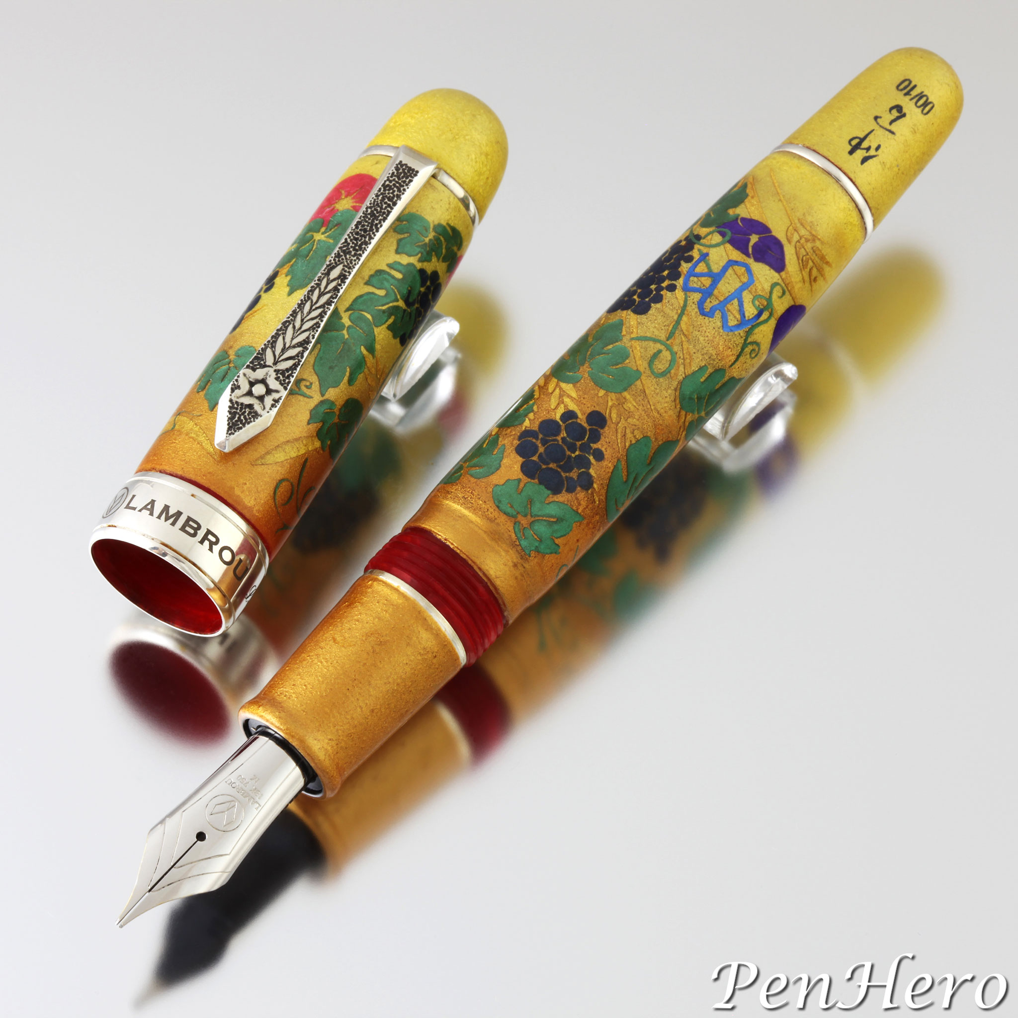
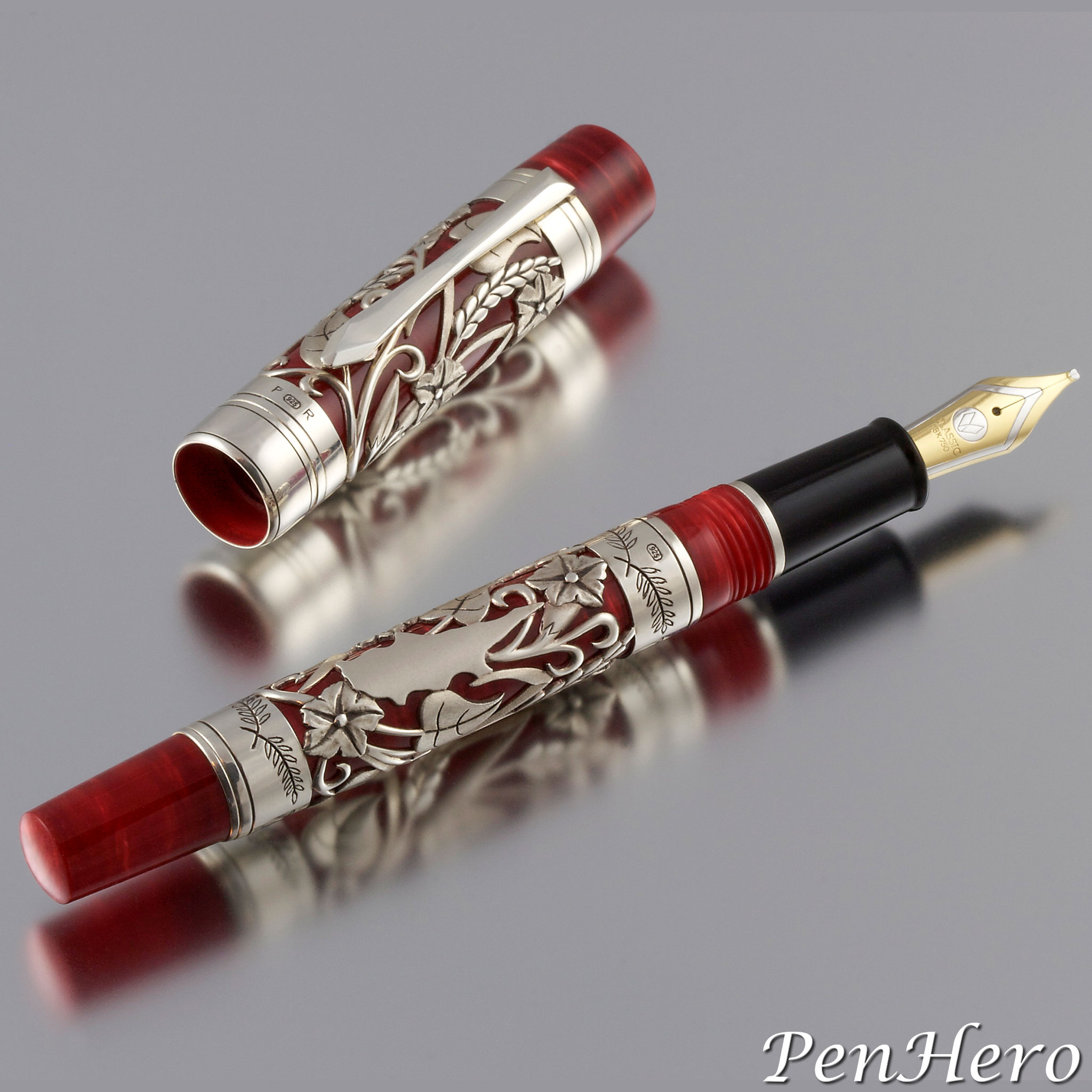
The Lambrou Pens LN2 Harvest artist proof shown here was made in July 2020. It’s a 6 inch long Lambrou Pens Oversize Legend hand crafted by Paul Rossi from Flame Red diffusion bonded acrylic with a Rossi made sterling silver floral design clip. The artwork is by Yoshitsugu Nakama, and because Nakama is allergic to urushi sap the decoration is made with an inert material he seals with epoxy resin. The Harvest design is based on the an original watercolor by Jenny Lambrou that was used for the other Classic Pens / Lambrou Pens Harvest models and represents harvest time on the island of Cyprus. Nakama’s interpretation is painted the cap and barrel with grapevine leaves, bunches of grapes, wheat stalks, and morning glory flowers over a pale yellow-brown coating to highlight the wheat artwork.Read the story about this interesting pen here!
Lambrou Pens Rossi Harvest Prototype 2009
In 2009, Paul Rossi was asked to create a sterling silver overlay pen with a similar design as the 2001 Classic Pens LR2 Harvest with a few notable changes. This design is executed on 1.5 mm thick sterling silver tubes that allowed Rossi to carve the high relief design and with the textures and details that enhance the individual components of the work. The final design is a composition of intertwined morning glory flowers and wheat stalks on the cap and barrel overlays with a silhouette of the island of Cyprus surrounded with the design on the barrel sleeve. The island image pulls the design into the local scenery that inspired it. Other new design elements include olive branches engraved on the bands above and below the barrel sleeve and extending the cap sleeve to the edge of the cap lip, creating a sense that the overlay extends continuously from the cap to the barrel when the pen is closed. The clip is hand crafted by Rossi in sterling silver. Paul Rossi placed his hallmark on the cap band and top barrel band.Read the story about this interesting pen here!
Lambrou Pens Psaróvarka Prototype 2010
This prototype is the Lambrou Pens Psaróvarka or ψαρόβαρκα in Greek. It was made in 2010 using a brass Legend 778L as the base for the guillochage work. Psaróvarka or ψαρόβαρκα is a Greek word used for small fishing boats, and the deep engraving, with its broad braided look, evokes the heavy corded nets and ropes used on them. Like the CP8, it’s a 6 inch long cartridge/converter fountain pen. The R. Murelli Company used a modern circular engraver to complete the guillochage work. The finished pen was then coated with 5 microns of silver plate to provide an example of how it would look in sterling silver. Like the CP8, the engraving extends past the clip and also to the round end of the barrel. The clip is a hand crafted sterling silver piece by Paul Rossi. The nib is a G-380, 18-karat gold nib unit with ebonite feed by Peter Bock and is rhodium plated to compliment the sterling silver clip and trim.Read the story about this interesting pen here!
Vogue Streamlined Fountain Pens c. 1941-1948
What is the attraction of Eclipse Streamline pens and their kin, the streamlined Eclipse Vis-O-Ray and the Eclipse Hooded Knight? Maybe it’s the cool names. Names from another era. Imagine Buck Rogers flying in his Streamline cruiser spaceship shooting his Vis-O-Ray at Ming the Merciless with his sidekick the Hooded Knight! It could be the funky, halfway over the cap top clips. After picking up dozens of them and looking out for more, some very similar pens with the same crazy clip would appear except these were marked Vogue.Read the story about these interesting pens here!
Parker 75 Americana 1975
The Parker 75 Americana, often called the Parker 75 Bicentennial, is probably the least Parker 75 pen there is. The cap and barrel shape say 75, and with the cap off, the section and nib confirm it. Yet cap on, it’s quite visually different, starting with the clip. Instead of the expected Parker Arrow type found on every other 75, this clip is a tapered bar that ends in a ball and is possibly made from the same pewter as the rest of the pen. Perhaps since the pen is an homage to a much earlier period in American history, Parker thought the clip should also reflect an earlier time, like the ball end 1916 patent clips of the early Parker Duofold and Jack Knife pens. The cap top (crown) and barrel end tassies are also different, tapered and cup like, with the top one having a wood insert.Read the story about this interesting pen here!
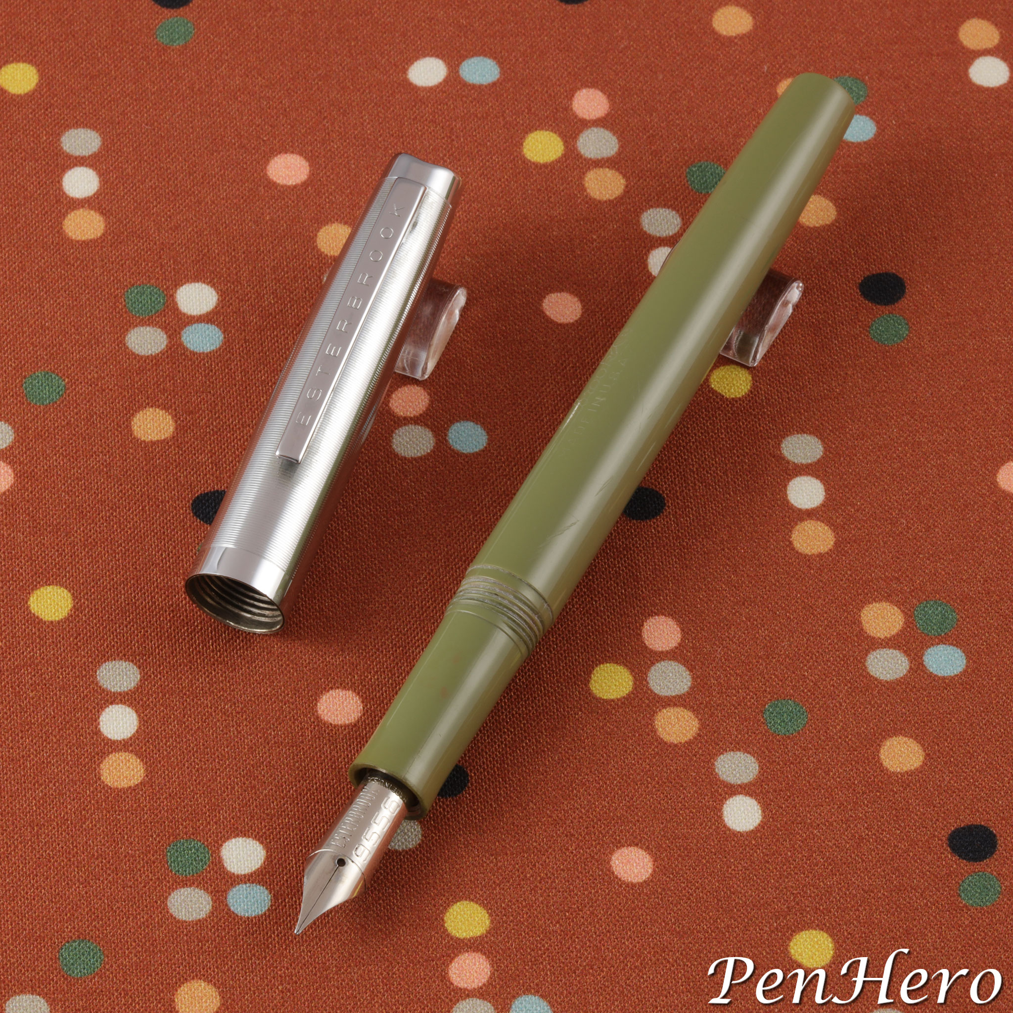
Esterbrook Classic M2 c. 1959-1962
Esterbrook’s most popular and best-selling fountain pen has to be the J series. They remain popular today and are the focus of many pen collectors. Less well known are the several Esterbrook models that follow the J series, including this one, the Classic M2, one of the few squeeze filler equipped Esterbrook pens. The 5 1/4 inch long Classic M2 was designed by Henry Dreyfuss, the gist of which appears to be the crease in the cap top, like the crease in a fedora. The cap is polished stainless steel and comes in two versions, one with a plain chrome plated clip and the company name stamped on the cap band and the other with ESTERBROOK stamped down the chrome plated clip and with a plain cap band. The best feature is the pen can use any of the 32 different screw in Esterbrook Re-New-Point nibs.Read the story about this interesting pen here!
Eagle Pencil Company Reversible Nickel Plated Penholder c. 1870s-early 1900s
This simple, plain Eagle Pencil Company reversible nickel plated penholder is similar to many other reversible pocket pen holders made in the late 1800s through the early 1900s. It's a 4 5/16 inch dip pen holder (capped) designed to house the nib unit safely in the barrel when not in use and reversed and inserted into the barrel when needed, making the pen holder convenient for pockets and purses. The barrel is stamped EAGLE PENCIL CO. NY. It appears in the Eagle Pencil Company c. 1900 catalog, but it's likely that these were made at least as early if not much earlier than 1887, when Eagle introduced the Arrow Pen-Holder, an improvement on this type.Read the story about this interesting pen here!
Your on-line writing instrument magazine, featuring detailed reviews, history, news, shows, and product announcements, and more links to writing instrument focused sites than any other source.
PenHero.com Privacy Policy: The PenHero.com and PenBookmarks.com websites do not collect or store any personal data. We do not generate cookies. Never have and never will.
Contact us: Click here to send us an email!


